Greetings from the Critique Club.
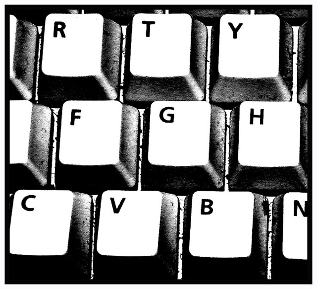
This is a nice photo that should have done better in the challenge. Unfortunately, many people feel that there are far too many keyboard shots taken on a regular basis. Most people don't look at the photo closely, just see it's a keyboard, score it low and move on. I like this photo because you show the keyboard differently the others. It has a gritty feel to it. Almost unreal looking aswell. The white of the keys is a little too bright in my opinion. I like the fact that it is too bright to see any texture on the key though. So if there is a way to lower the intensity of the white without adding texture to those keys than it would be great. I really don't have much else to add to improve the photo. I think it is very good and should have done much better. I hope this hasn't turned you away from submitting again. All the photos you have taken so far are very good and you should definately keep it up. Good luck in future challenges.
Thanks for your comment! I was a bit deceived but I admit that it was not an orignal idea. I don't always have time to take pictures that meet the challenge but since I found this place, I can't take not to submit so I chose the keyboard as subject of this challenge. As you say, unfortunately, there isn't place for just technical quality pictures, artistic and uniqueness is a big criteria here. Would be an idea to have 2 voting panes, one for artistic and the other for technic. Any way, don't worry, I will keep up submitting!
Greetings from the Critique Club.
This is a nice photo that should have done better in the challenge. Unfortunately, many people feel that there are far too many keyboard shots taken on a regular basis. Most people don't look at the photo closely, just see it's a keyboard, score it low and move on. I like this photo because you show the keyboard differently the others. It has a gritty feel to it. Almost unreal looking aswell. The white of the keys is a little too bright in my opinion. I like the fact that it is too bright to see any texture on the key though. So if there is a way to lower the intensity of the white without adding texture to those keys than it would be great. I really don't have much else to add to improve the photo. I think it is very good and should have done much better. I hope this hasn't turned you away from submitting again. All the photos you have taken so far are very good and you should definately keep it up. Good luck in future challenges.
Composition: Great
Technical: I really like the contrast and colour.
Meets challenge: Yes
Overall impression: The best keyboard pic I've seen so far. 8
The letter appear clear. It was a good idea for squares. What type of tone did you shoot in or is it black and white? I might have tried sepia to see what that might look like, otherwise this was a good image.
I've joined this site about a week ago and I've already seen several pictures of keyboards. Please, no more pictures of keyboards! Get away from your computer before you start taking photos! No offence intended to the photographer, I'm just pleading for more original subjects...





 Add photograph to your favorites
 Add photographer to your favorites


 Photographer found comment helpful.


