I like the title, it's funny but I usually do not rely on the title.
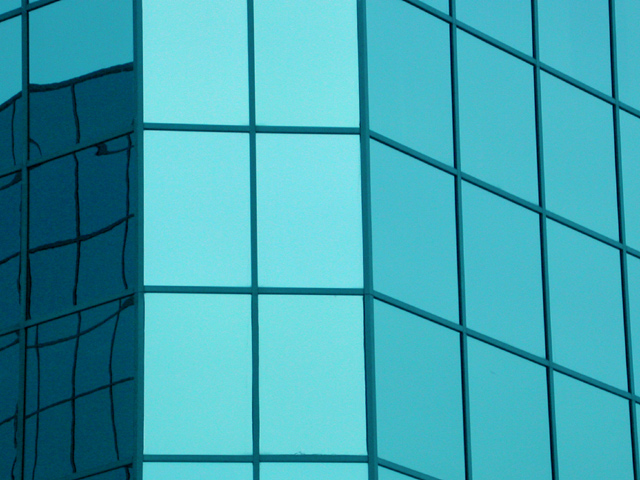
At first glance, I'd say this photo does not have enough substance. It also does not help that the windows are not square. At least the section you chose does not appear squared. The windows on the right section look to be more square. The reflections on the left side are a tiny bit distracting, I'd try to compose so that they do not exist and emphasis is on the right windows.
Not sure what else to add to this, it's a very "simple" image in terms of substance.
Composition: Good, although the dark reflect on the left seems to throw the pic out of balance a little
Technical: Good focus and colour. Good size. May have chosen a thin border, but maybe that looked bad with the window frames..
Meets challenge: Yes
Overall impression: Good choice of shot, but would have preferred a different angle I think. 6
Good idea. The way that the sunlight bounces off the glass gives this image a good overall look. I think that the windows are a little more rectangular then square shaped. NIce image.





 Add photograph to your favorites
 Add photographer to your favorites

 Photographer found comment helpful.


