| Author | Thread |
|
|
06/06/2015 04:56:16 PM |
|
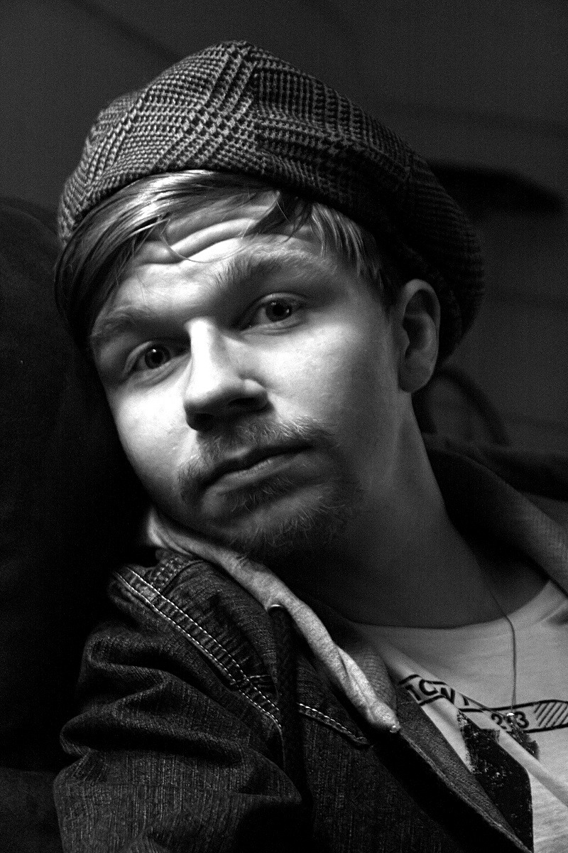
This is a very strong portrait. True there are some blown out whites, but, regardless, you have captured something here. Nicely, done. |
|
Comments Made During the Challenge  |
|
|
06/04/2015 12:10:22 PM |
|
Missing the color of the original here |
|
 Photographer found comment helpful. Photographer found comment helpful. |
|
|
06/03/2015 09:57:26 PM |
|
Didn't check the original but this stands on its own. Very good, satisfyingly resolved subject with composition. bump |
|
| Photographer found comment helpful. |
|
|
06/03/2015 01:44:18 PM |
|
Prefer the original, but that's not a knock on this lovely portrait. Would have liked to have seen the unusual-for-a-portrait landscape orientation. Still, one of my favorites. |
|
| Photographer found comment helpful. |
|
|
06/01/2015 04:09:45 PM |
|
so totally different, yet I feel the expression belongs just as much to the subject as it does in the original. interesting to compare. |
|
| Photographer found comment helpful. |
|
|
05/31/2015 10:47:18 PM |
Why thankyou!
If it was in color and in a landscape crop with a younger boy maybe would of scored this higher. His face is over exposed also.
Nice try though, I love the hat. |
|
| Photographer found comment helpful. |
|
|
05/30/2015 05:30:18 PM |
|
If there was a chair, I wish I could have seen more clearly. But I like this and think it is pretty good reimagining. |
|
| Photographer found comment helpful. |
|
|
05/29/2015 12:50:12 PM |
|
Both tis and the original have definite charm. I find myself liking the original better, mainly because of the light on the eyes. |
|
| Photographer found comment helpful. |
Home -
Challenges -
Community -
League -
Photos -
Cameras -
Lenses -
Learn -
Help -
Terms of Use -
Privacy -
Top ^
DPChallenge, and website content and design, Copyright © 2001-2026 Challenging Technologies, LLC.
All digital photo copyrights belong to the photographers and may not be used without permission.
Current Server Time: 05/15/2026 03:20:36 AM EDT.