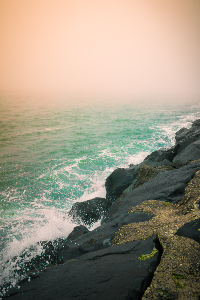
is the colour overdone? I could not say, because the composition of shapes and textures is compelling, and late in life I am coming to see that colour always plays a role...
If these colors are how you saw this view, I bet it was spectacular. Unfortunately this did not connect well with me, the view was just so narrow that aside from enjoying the pink and green, nothing else really held my interest.
Love the colors - the peach and pale aqua are lovely together. I also like the three part composition - square of pink and triangles of green and shore. However, the scene is not that interesting to me.
Commenting only at this point - accepting Melethia's challenge; yours is image #8 in my random display order.
Applaudably bold take on this challenge. This sky is an odd color and mixes curiously with the sea, but I like this. The diagonal created by those black rocks slashing across the image makes a strong statement. Wishing you good fortune with this 'out-of-the-box' interpretation.






 Add photograph to your favorites
 Add photographer to your favorites


