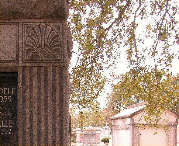
I like how the square isn't the main focal point in this peice, but I think however that the other tombs are distracting. If it was just tree or something...?
Composition: The difference between the stone tomb on the left and the bright view on the right makes it slightly unbalanced for me.
Technical: Good focus and colour.
Meets challenge: Yes
Overall impression: I love the stone work, but the composition seems to let it down a bit. 6
The trees look a bit washed out. I think I would prefer the photo with it cropped to meet the square on the top left hand side. Hope you understand what I'm saying.
The whole right side of the photo appears washed out. And it contains several squares. I can't tell if the square with the fan in the stone on the left is supposed to be your subject. If it is you should have somehow cropped out the rest. That stone is nicely focused, clear, readible, nice color, but it causes the majority of the photo to wash out. Personally I'm ok with the photo, not excited but ok, but I have different tastes from most. I'll give it a 5. Needs better execution.





 Add photograph to your favorites
 Add photographer to your favorites


