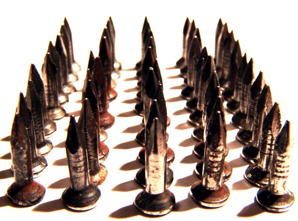
Lined up nails (crooked) on white sheet of paper placed the light to get some cool shadows
cropped, tuned contrast and brightness..the end
i didnt realize they were crooked until i got them on my monitor, but it isnt as easy as it seems to line those tiny nails up straight. i had to do it with an ink pen. after i realized they were not even i a had already put up the nails. oh well...i still liked it.
Statistics
Place: 146 out of 173 Avg (all users): 4.7500 Avg (commenters): 5.0000 Avg (participants): 4.5619 Avg (non-participants): 4.9670 Views since voting: 713 Views during voting: 299 Votes: 196 Comments: 10 Favorites: 0
for what it's worth, i had a couple free minutes; hope you don't mind that i've picked your image out for a random comment. if you don't like it, let me know, and i'll remove it.
i scored this a 6 simply based on meeting the challenge. from a technical standpoint, it needs work. the lighting is too strong and the dof is a little too shallow. i don't know what settings you used without seeing the exif, but i also know your camera is capable of a much better shot (after all, this is the same camera the jjbeguin uses).
from a composition standpoint, it would have been stronger if the nails had completely filled the frame, going out the back, and further to the left and right. i didn't mind the crookedness, but, all the same, imagine what might have happened if you had put the same effort into lining up and positioning these nails the way Artyste did his mints...
what i would suggest doing, rather than beating yourself up over whether or not you entered the right image, would be to take the critiques and go back and reshoot it better. look through the other entries and find one similar to yours that finished better, and try to determine what made the difference.
[note: i picked the wrong entry out of three options. can't do much about it now, except go shoot something else.]
I think you've got the implied lines well, however, the photograph itself is difficult for me to look at. I find it oversharpened, far too over-exposed (especially the background), and off-focus, which are three primary elements in a still. Also, I'd suggest spacing the subjects further apart, which would have given the shot a little more dynamic. A shot like this can really benefit from not having the negative space around the sides and back.
Degree of difficulty is pretty high here, getting a crisp focus on highly reflective surfaces. I believe I would like it better if focus were sharper. The white is a bit too stark for me as well. Probably a matter of personal opinion.





 Add photograph to your favorites
 Add photographer to your favorites

 Photographer found comment helpful.


