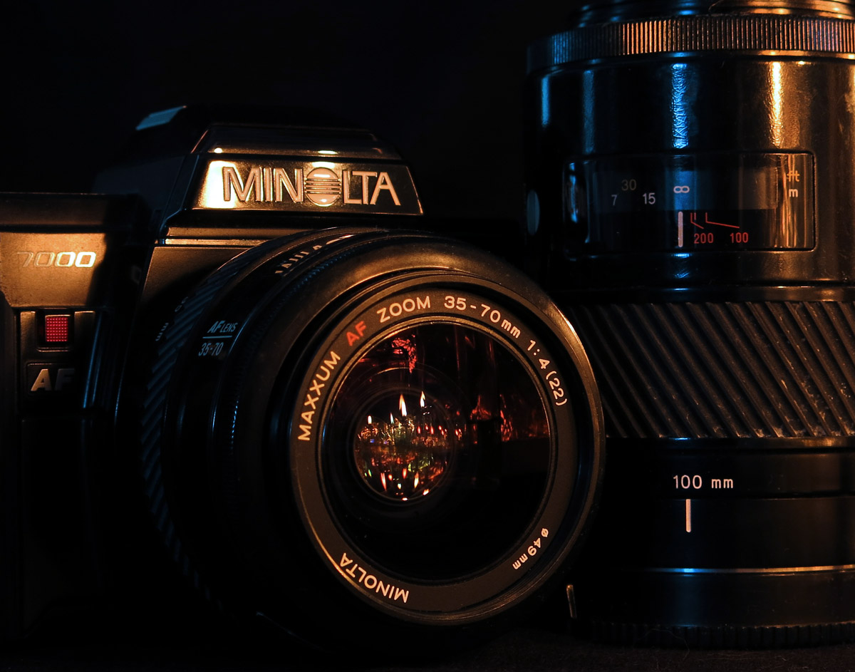
I love the tight crop and the DoF.
The lighting in general is good, except for the mixed colours. The combination of bluish, white and yellowish highlights is a bit distracting. If it wasn't correctable in post, you should have gone with B&W (maybe recover the color on the red elements afterwards). Unless, of course, the mixed lighting was your intention. A bit more microcontrast/structure/clarity would have been nice, as well.
All in all, a solid take on the camera portrait challenge. |





 Add photograph to your favorites
 Add photographer to your favorites


 Photographer found comment helpful.


