Greetings from the Critique Club };-)
Initial thoughts
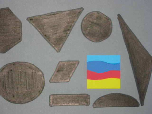
Interesting composition, meets the challenge, seems a bit soft on focus
Composition/ Content
This seems to be a good idea that possibly wasn't carried through as much as it might have been. The colored square shows up well but the other shapes appear hastily drawn. If they had been cut out from black or filled in better it would have made a more dynamic shot.
Background
The background seems to work although a bright color would make the other shapes show better.
Camera Work - Technical
Focus seems a little soft and the whole shot seems pretty two dimensional. Perhaps an angled light or raised shapes would make it more vibrant.
Digital Processing - Technical
Sharpening would have helped. I wonder how you got the colored square in the shot as it seems to be attached to the background. I don't know for sure if it is lying flat or not.
Fits The Challenge
Fits the challenge well.
My Opinion On The Photo
I originally scored this shot a four as did most of the voters. I think that it meets the challenge but wasn't a real big attention grabber. Good job, and keep up the good work.
I would be happy to talk further about this shot if you would like to contact me.
DougPaz
|






 Add photograph to your favorites
 Add photographer to your favorites


