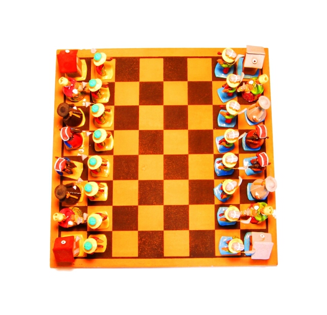
brazilian clay chess set taken on a white board, overexposed, saturation maximized, gamma reduced. yes, i know there is a slight angle so that the board is not perfectly square with the cropping . . .
Statistics
Place: 153 out of 179 Avg (all users): 4.4596 Avg (commenters): 4.4545 Avg (participants): 4.3853 Avg (non-participants): 4.5506 Views since voting: 1015 Votes: 198 Comments: 12 Favorites: 0
COMPOSITION... I find the composition very pleasing, if not for some of the technical errors I will cover in my next paragraph... I think it fits the challenge very strongly, a very pleasing and symmetrical composition. Your description mentions your board is at an angle, but its too slight for me even to notice. I like the bird's eye framing, and the fact that its a unique and colorful chess set you just can't find anywhere. The whiteboard provides an elegant natural frame to the photo and really makes the colors stand out by putting them next to a space with absolutely no color at all. i didn't find there was too much negative space, and this comes from someone who generally does not like empty space in photos :) I think if you took out more white, it would look like an ordinary shot of a chess board.
TECHNIQUE... It was apparent even without your comments that the photo's saturation and exposure were pushed to the extreme. I'm not exactly sure why you chose to do this, though I do understand that it was intentional and not an "error" on your part. Nonetheless, I find the over saturation deteriorates the quality of the image you have, and makes it appear grainier than it should. Not a grain that's typical of a high speed 35mm film, but a grain that's courser, more pixellated and not as appealing as film grain. I tried reversing the saturation back to a normal level, and also removing some of the overexposure, and find the resulting image just as appealing, if not more appealing than this interpretation. I think the shot would actually look more fine and detailed without the extreme image modifications made. If you want to give your photo more punch, before saturating, try a levels adjustment. After i de-saturated the image, I played with that and the final result looked really sharp, and still colorful and full of a wide variety of tones.
OVERALL... good composition and subject matter, but I think your score and image quality suffered from the extreme post-editing performed on your shot.
Wish I could see what your playing pieces are, but not a good angle for that. I can tell they are not the normal pieces. And this is my biggest complaint. This one may sound rediculous but your playing square appears not to be square, wider at the bottom than at the top, or are my eyes playing tricks on me. To me the frame hurt you on this one. Without it I might have thought the playing board was all of the photo, and would not have noticed that it isn't square. Just a thought. But still not a bad photo, just not a great one.
The background is a little too bright. It does not contrast well with the colour of the board. I think maybe a different angle would be more effective. jgillard5






 Add photograph to your favorites
 Add photographer to your favorites

 Photographer found comment helpful.


