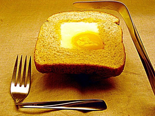
I like this picture. The your take on this idea is very good. Much better than the many other square meal picures. But the quality and lighting is lacking.
What give this "square meal" it all over the others is the destroyed flat wear. That's going the extra mile for it. The background does need smoothed out a little
I think this would be more interesting if you changed your lighting so the bread looked whiter (if it is white bread) or browner if it's brown bread. Can't tell.
Interesting image. What strikes me immediately is the way the toast is levitating above the tablecloth, reinforced by the position of the knife. Is there a reason for this? It's attention getting, but a little unclear w/r/t intent. Some white balance and sharpness issues, but good work.
Nice compositon but the yellows are too harsh and doesn't make the meal look that appetizing. I don't feel like eating now (which I think should be the objective of good food photography).





 Add photograph to your favorites
 Add photographer to your favorites


 Photographer found comment helpful.


