|
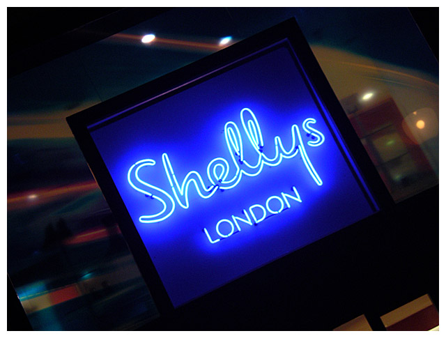
i'm quite surprised i like this - maybe it's partly to do with civic pride (its london innit), but i strongly suspect it's how you've made something seemingly dull look quite arty. the angle certainly helps - but its also the strength in the colours of the sigh compared to its surroundings. everything feels so bustly around it... it's in the same vein as those posters of starbucks you see in starbucks... not entirely sure about having white for the border (what would have been really clever would be to copy the sign, you know, black with a thin blue line), but that aside, this is a strong image that suggests to me the photographer had quite a bit of thought. very excellent. 9. |






 Add photograph to your favorites
 Add photographer to your favorites


 Photographer found comment helpful.
