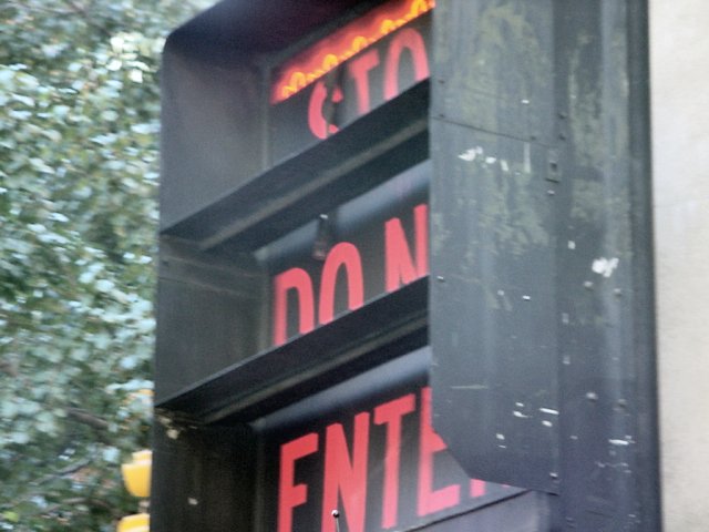
This looks like it was taken through the window of a moving bus or train. A crop to exclude the background at L and the bit of wall (?) at R would be a good start, followed by a dose of auto levels to give it some snap.
This photo looks a little over exposed - the black isn't very black and the red looks washed out. Also having part of each work hidden is a little uncomfortable. Perhaps you were trying to create the illusion that you weren't stopping (ie: were moving past the sign) however this thought didn't occur to me for quite a long time (ie: several viewings) so it's not obvious.
Interesting angle shot, I get the message, but obscured as it is, it's hard to read. The background "feels" like it's moving - was it a windy day or were you in a moving vehicle? (both guesses) 7 Swash
The angle is just a little sharp. Box should have been in sharper focus. I personally would have cropped out the white pole on the right side. Great idea and composition, just needs better execution. Still a 6.
Cropping this tight was a good idea, but for me it needs to be sharper. It also looks like it was taken looking through a window, which has washed it out a bit.




 Add photograph to your favorites
 Add photographer to your favorites


 Photographer found comment helpful.


