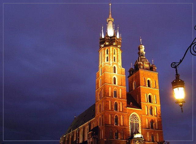
I think the composition here is lacking; You can't just cut a building off a few feet from the ground and sow the sky above. Also the lampost is a bit too much; the light looks fake and digital.
The borfer is a great Idead, but nothing can overcome the problems with angle and composition.
I love the borders. I wish the clouds didn't have any noise. You can take care of that in photoshop by using the blurring brush tool at about 15-20%, or "despeckling" (i usually use the spot fixer brush tool to blur though because sometimes despeckle takes out needed detail).
The extra sky on the left really works to give the building a sense of presence, the lamp serves to provide an almost ironic illusion of lighting the building - very creative inclusion, well done
Interesting lighting but composition could be improved. I'd like to see the bottom of the building...and crop a lot off the left side. The hanging light on the right is nice.
And respect to you for fighting the temptation to rotate the camera 90 degrees to do a portrait orientated shot. the use of negative space certainly works in terms of composition. the colours are wonderfully rich, the brickwork contrasting well with the purply sky. I think the street lamp is a bit unwanted - kind of mucks about with the scale of the church making it seemingly less impressive. can't decide if i like the border - in terms of presentation it's a bit like one of those paintings with the picture flowing over and into the frame, an effect which i never liked much. it is a nice picture, gorgeous building and lovely sky... 7.
spaniale zdiencze! great shot of the church. i have good memories in and around that square. and that lamp is beautifully incorporated into the pic. nice cropping... i cant help but give you a ten (and on the first photo i vote on!) i just think the border is a bit much.





 Add photograph to your favorites
 Add photographer to your favorites


 Photographer found comment helpful.


