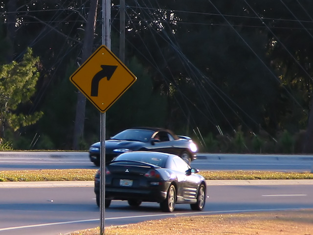
COMPOSITION... There are several aspects to the composition that can be improved, and they mainly center on the placing of elements in the photo. The cars overlap and would probably be better at opposite ends of the photo with the sign in the center. Would make more of an impact, with one car moving away from a sign that is pointing in the other direction. I know that shots like this aren't really planned, they just happen, and not much planning can really be done to ensure you're at the right view point at the right time, but then luck will often play an element in photography :)
That said, there is too much overlapping, one car on top of the other, the signpost cutting across both cars. The background is slightly distracting with so many elements in it. On stretches of roads such as these there are probably some areas that have a nice, clear background. Even if you're fixed to this spot because you were capturing the sign, you can try moving to your left and right...sometimes a small adjustment in your position changes the nature of your image drastically.
TECHNIQUE... Perhaps you needed a faster shutter speed, the cars look slightly blurred, and I think the light that's reflecting off the cars is a little to harsh... Not much can be done there, the rest of the image is very well exposed, maybe the timing of day played a role. Its important to shoot at times where the light's working in your favor and not causing any harsh or unintended reflections.
OVERALL... a little luck and a different viewpoint that makes a cleaner composition is all I think it needed. Either than that, you managed to capture an example of very good timing :)
Neither car is entirely in focus. They both seem kind of out of place in this image. Composition is essentially OK, but overall the photo really lacks a clear subject. 4 md
Was this ever a 1 in a million chance for you: 2 eclispes together at a road sign. Don't think I want to say anything bad about this or who ever gave it to you might get me. This is not saying anything bad, understand that, but I would have liked it a little lighter in the background, and maybe a hair sharper focus. But it's still a 6.
Cute title! I like the inclusion of the cars, definately adds. I know they are moving, a faster exposure might have made them more solidly in the shot. Sorry about the poles and wires, I know it couldn't be helped, but sure doesn't add to the shot. Very strong focus on the sign, very nice. 7 Swash
I am guessing that the cars are known as the Eclipse in your part of the world? It's a clever idea, but I think it would have been better if the cars and the sign weren't all lined-up.




 Add photograph to your favorites
 Add photographer to your favorites


 Photographer found comment helpful.


