Greetings from the Critique Club.
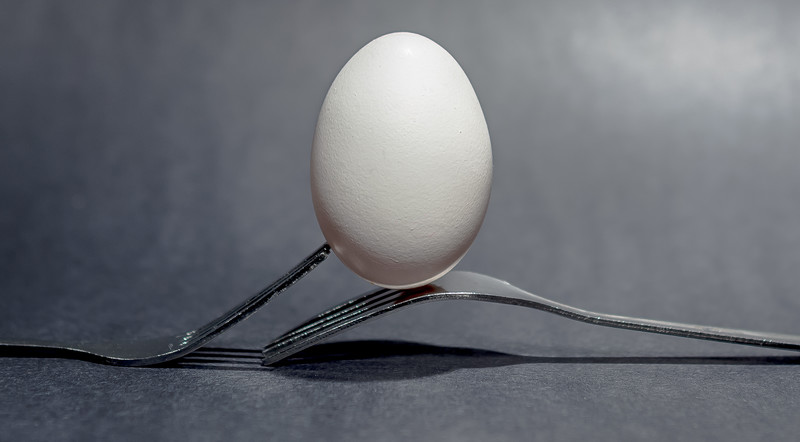
As usual, you have presented a clean and well-composed image,  clickodak. clickodak.
except for just a little color at the bottom of the egg, this image looks nice in black and white.
However, in competition, this may have been a drawback, as it just is not very exciting.
I do wonder what it would have looked like with a more colorful background. And then, the tines
of the fork appear to be a bit worn and well, not beautiful. They did not act as a perfect foil
for that very symmetrical egg.
so, while the lighting was good and the composition was good, the overall effect was not exciting.
And you use color very, very well in your work. |