Critique Club:
Really lovely image, and one I gave an 8 during the challenge. That said, as I look at it again, and read your comment regarding your surprise at the score (something we've all done, right?), I believe I see some things that may have earned you that very solid 6 and not something higher.
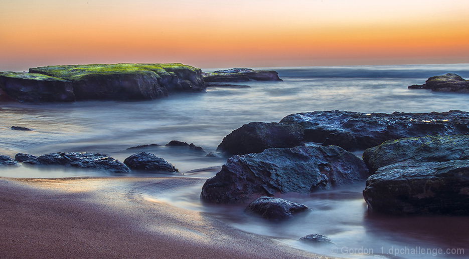
First, let's talk about what works. With ND's and moving water in this kind of light (as opposed to hazy, horizonless skies) it's essential to nail the exposure time so that you don't completely wash out the water but still soften it enough to be ethereal, and you did that very well. The pastel colors and cool highlights on the foreground rocks work very well, though you may have burned in the highlights just a little too much. The moss pops on the background rocks and adds a nice contrast to those in the front.
What doesn't work? The two most obvious things for me are the crooked horizon, and the extreme haloing over the moss covered rocks (some in the fore as well), which is what I believe most folks would have given you a hit on. While the horizon is at a 1.5 degree tilt, a lot of that is masked by the wave and it made me miss it at first (I'm usually a stickler), but the fact is it's there to be seen and should be corrected. The halo is merely an artifact of over-structuring or sharpening. Really a shame, because it's so easily eliminated with the Clone Stamp tool in Photoshop (or Elements). The 16:9 cinematic crop is nice, but it makes me wonder if the original would have allowed you to bring the water line out of the bottom right corner and lead the eye into the image a little better?
Still, a lovely image, well seen and taken. |