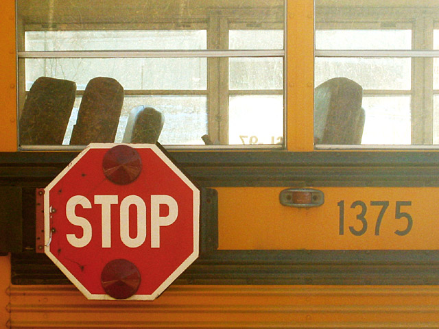
Same school bus as my 'childhood without children' photo. Nothing else special, cropped, some level and saturaton adjsutment and a little bit of sharpening.
Statistics
Place: 153 out of 174 Avg (all users): 4.5650 Avg (commenters): 4.8333 Avg (participants): 4.4595 Avg (non-participants): 4.6966 Views since voting: 1059 Votes: 200 Comments: 13 Favorites: 0
Critique Club Comments by Grayce M. Dillon aka Gracious
The first thing to strike me about this image is the coloring. Yellow and red are both vibrant and cheerful.
The next thing to attract my attention is the familiarity of the subject. Quite universally appealing I think.
I like that you composed the picture with the sign off-center.
There is a line across the center, dividing the image in half. Not especially pleasing. The other drawback is the over-exposed windows. I understand the problem is that by seeing through the bus the highlights were unavoidable. Perhaps the solution may be to expose for the windows, or maybe eliminate the windows completely with a different composition. The coloring here makes a very worthy subject.
Focus is a bit too soft, and saturation could be boosted as well.
Regards,
It looks like that stop sign is tacked to the bus. This is an interesting shot, but I feel the colours are a little washed out especially the more to the right you look.
Never thought of this as a "road sign" but I guess I really is. Great ingeniuity. But tell them the bus is filthy and to wash it. Good photo. The technicals are pretty good. Not really exciting but right in there. It's a 6.
Nice subject and composition although the photo is a little grainy. The black is a little washed out (perhaps levels in photoshop could have helped) and the yellow is showing some artifacts. Of course, depending on the camera (and or zoom) used you may have done quite well.






 Add photograph to your favorites
 Add photographer to your favorites

 Photographer found comment helpful.


