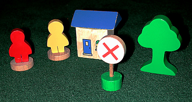
It's a nice alternative take on the subject. I think I would have got a lower viewpoint, so that you aren't looking down on the objects. Maybe include a toy car?
Good focus and color. The flash shadows are a tad harsh. It's cute. Whatever you used for background (floor) works with this set up. You might want to try moving back a bit or reducing the power of your flash (if feature possible). It's just a little to strong. 6 Swash
sorry - i didn't find this a compelling photo. the title helps make it work (although the title might work better with a photo taken of a real sign from a low POV), and i'm having problems saying why i don't like it - the quality is fine, there is a sign in the picture, and on an originality scale it is okay. maybe its because signs tend to be part of outdoor environments and you expect space and scale, and this portrays the opposite of that. also your sign is just sitting there - there is not context/purpose to it in your composition.






 Add photograph to your favorites
 Add photographer to your favorites


 Photographer found comment helpful.


