Very clever. I get it. Excellent use of the challenge with the perfect amount 'personality'. Im in agreement with everyone, as well as the author of the photo about the border.
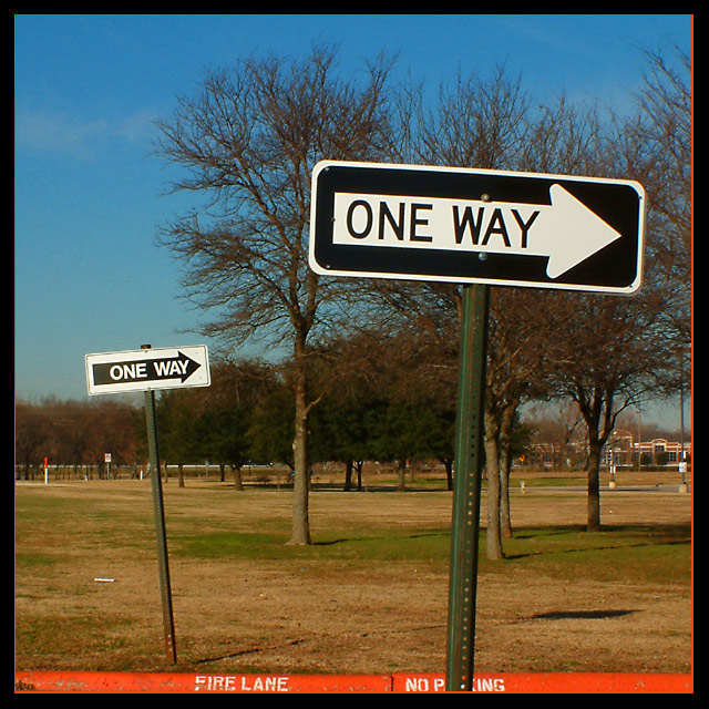
My very initial reaction was "that front sign is superimposed" - the reason is your red border line. It merges with the red painted gutter and makes the signpost float. I'd suggest a different border perhaps. The focus on the sign is wonderful, the image is perhaps a tiny bit too dark but not my much. Composition is good.
I gonna find ya...... sorry just couldn't resist. Very catchy title. I really like how you drew the red color from the shot to the border, but my attention is drawn to that part of the picture first, I don't know if that was your intention or not. I like the depth both of the signs create (the fire lane does help with this also), and you kept the 2nd sign in focus, I like that. There is something that bothers me about the colors though, mabey a bit too yellow, can't totally put my finger on it right now. Was it a hazy day? There is also red spots all through the trees which doesn't look natural, you may have over saturated the red a bit too much. I figured you saturated it to get the effect with the fire lane. If you did, that may also be causing the color problem.
Overall I like the effect with the fire lane, but I feel your colors were a bit off. Thanks for reading my ramblings. 8.
Good catch, and the square format is working for me. I'm absolutely not feeling that orange inner border, though. Too constricting, and stops the apparent 'motion' of the signs.





 Add photograph to your favorites
 Add photographer to your favorites


 Photographer found comment helpful.


