Not even people; just keep on walking. Could use a sharper focus. Even the signs are a little too soft on focus. Good composition, but needs better execution.
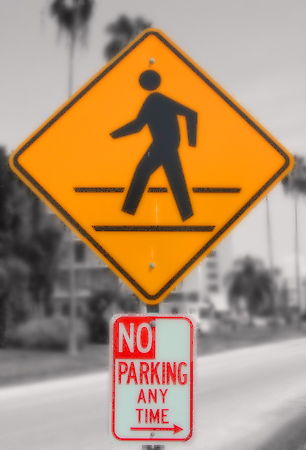
A little out of focus. The background seems to be in black and white which gives the photo a nice effect also bringing out the colors in the signs more.
I like the background blurred it would have been to busy otherwise, but the sign seems to be a bit too blurry also. Did you try to sharpen it using PS or PSP? You may want to try a few different angles also. I personally don't care for things perfectly centered (well every once in a while) usually they are not as appealing to my eyes. The sign was OK, it is very hard to find any interesting signs around, but then again a different angle may have helped give the sign a bit more pizzazz. 4.
The technique of desaturating all but yellows and red in this is GREAT! But you should have not cropped it this tightly and shown a little more of the right, left, and to a lesser degree the top. But the sign itself is boring. Nice pic tho.





 Add photograph to your favorites
 Add photographer to your favorites


