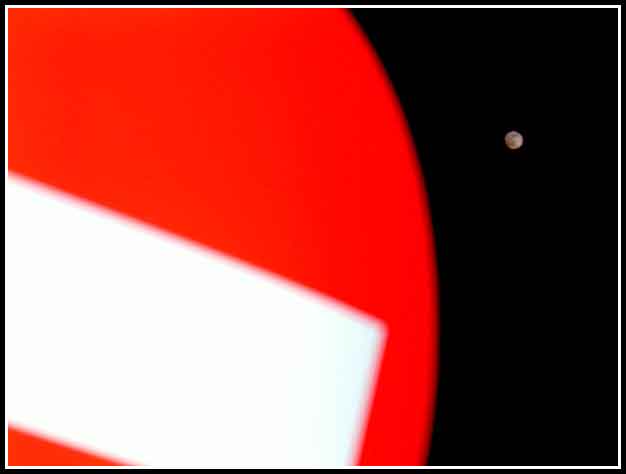
CC: I like the bold red colour against the night sky. The moon adds interest in your image as well. The interesting thing in this image is the fact that you have captured the difference in size (sign and moon) I really appreciate how you have done this. The framing in which you have chosen suits this image with the colours you have (red, white and black). Nicely captured.
I like your idea of the round picture in the forground and the round moon in the backround but unfortunately your out of focus takes away from the message.
Need more of the sign. Should have pulled back a bit. Sign also out of focus and shooting further away would have cleared that up, and still gotten the moon in. Would have been a good shot and met the challenge. As is I can't score it more than a 4.
A good abstract idea. I think you should have focused on the sign, as that is supposed to be the main subject, and the moon is so small it's hard to tell whether it's in focus or not. Nice idea, needs better implementation.
The sign fills up most of the frame, but it's blurry. That is hard on the eyes. I appreciate that you were trying to do something different, however. :-)





 Add photograph to your favorites
 Add photographer to your favorites

 Photographer found comment helpful.


