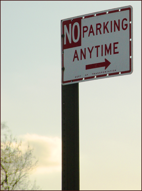
What we have here is a sign. Nothing wrong with it just being a sign, but the shot doesn't have anything that grabs my attention. The head on perspective although technically off to the side, and the pole being in the middle of the frame leaves my eye nowhere to go. The cloud and tree in the background could be used to enhancee this shot. By including more of them and less pole, you'd be contrasting the cold sharp edges of the sign with the curves and natural elements presented around you.
Technically the photo is sharp. The F/stop blurring the background gives good focus on the sign. Your lighting is a little soft on the sign and the colors are muted. Doing some manipulation with your software to make the sky deeper blue and the clouds warmer would help make this a stronger composition for me.
You have all the elements available to make this a stronger shot. Perhaps try some reshoots at different heights and angles to see if you can make the statement "NO" means "NO" stand out.
i would like to see more color or drasticreduction in color. the colors are just kind of there plain, i no that some peopl like these shots like this, I do like this shot i am just missing somthing fromit. thank and good luck!!!






 Add photograph to your favorites
 Add photographer to your favorites


 Photographer found comment helpful.


