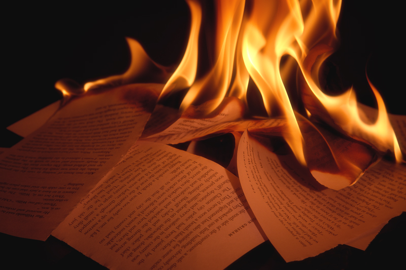
The very thing - but there are in my view too many unsolved elements. The flames seem really cropped and do not add the frightening element that I wish for. The pages (Grisham?) are almost delicately ripped and placed on top of each other too carefully only to be burned. The lighting is too even for such a terrible event.
I know how hard is to take such a shot, I tried it myself and made a mess in the building!
I bet we'll try it again though!
5 for effort
4...the fire could use a bit more breathing room I think. More contrast within the pages would work well also I think. The flames have a nice dance about them for sure.
Nice timing on capturing the flames. Seems like it could use just a tad more contrast and levels adjustment (to get the blacks a little truer). Overall a nice photo. Good luck.
My first thought was -- I wish I could see the top of the flames. The flames are quite nice. I wish there were more of them and less paper. The paper isn't as interesting. I think a different crop could have made a big difference on this shot. -5-
I hope no important books were damaged in this image. It's well executed (especially the flames) and exemplary as possible cover art for the book. But in its reduced, closely cropped form, it seems a bit sterile. 6
The flames and tone are just right, except that the tops of the flames are cut off. The best part of the fire shots are the wispy tops. Still, a burning page right out of the book! 6
I an one of a few that have taken on the” Comment on every vote challenge”. I will post the score I gave you then try to explain my reasons for said vote. Hopefully nothing below will be taken personally, and maybe we can both learn from it..
This is a tough one. I am impressed with your capture of the flame, but, I am also offset by the fact you destroyed a book to accomplish it. I’ll leave this as a 6 for now.
Nice shot. I've never read the book, but I've heard some about it.
I like how soft the flames of the fire look, yet there is a crispness to the pages. Nicely done. Bumping to a 6
Nice take, and very subtle & effective lighting. Wish you had let the flames burn a little longer to get some of those black bits of ash and burned pages to add to the complexity of the image. Still, I enjoyed it and very applicable to the chosen book title!
Negatives: yet another shot of something on fire with a black background. yet another shot of burning paper taken for this book.
Positives: you're burning John Grisham even though the title is Ray Bradbury. That's hilarious to me. Plus, the scattered pages go outside the frame, making for a more interesting composition.





 Add photograph to your favorites
 Add photographer to your favorites

 Photographer found comment helpful.


