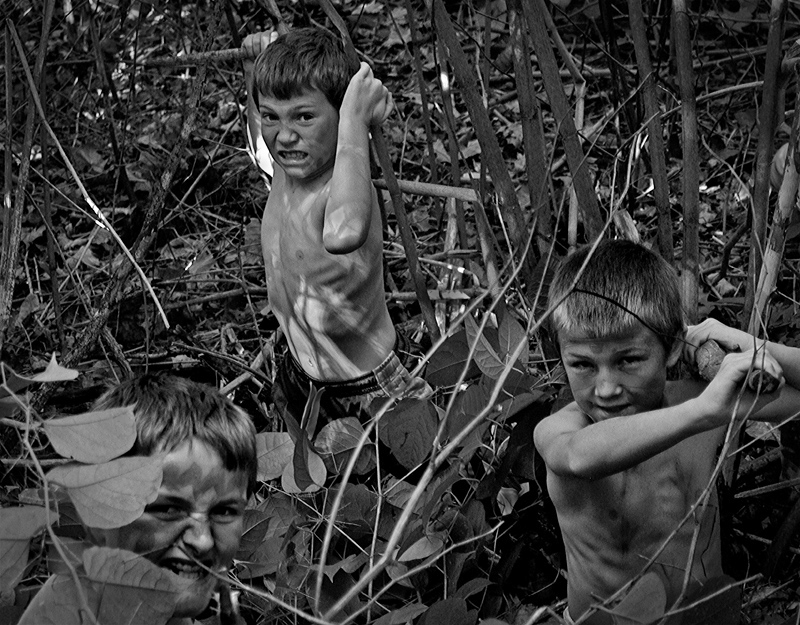
I like the shot and the faces, but it seems a tad underexposed and a bit flat tone-wise. I'd be curious what it looked like brightened and with a bit more contrast?
A six for you. Really want to score this higher -- I think it's the "Flies" entry with the most potential. The body paint is too hard to see though, and if I were to nitpick (and it seems that I am) the hair of the boy on the right looks too freshly cut. Still, I like the ferocity and think it comes close.
6...they are going to get you. Funny, all the Lord of the Flies entries were quite nice, this one included. Why the 6? Here's why...the B&W conversion could use some help. It's all very middle to deep gray with a few hits of light where the sun got through. Dappled shade is a beast to deal with. Besides a levels adjustment, you could use some levels masking to bring contrast to only specific areas. It's simple to do, and provides much better results than plain dodging or burning. With all the grays being so close in tonal value, like you see here, everything sort of just blends together in a mushy sort of way. I love the fierce little creature at the bottom left!
this is obviously the picture of Simon's camp, as opposed to the other entry i've seen of Ralph's, where the children are having fun.
a good representation of the nature of the book, the tight crop keeps the eye from wandering
a 7 from me
Incredible. This is truly terrifying and extraordinary. When you read the book, it is practically impossible to imagine little boys behaving in such a horrific way. This image hints at that possibility. Well done
This works rather well with the novel :-) The expression of the central boy's not entirely convincing, but the unexpected face in the lower left is priceless. I like the matter-of-fact processing and the artless composition. By "artless", I mean that it doesn't seem forced or unnatural or contrived, it feels spontaneous.
Some boys playing with sticks in the woods. By their expressions I'd guess they're meant to be hunters. I'd expect to see them a lot more scruffed up, like with scratches and bruises on their arms etc (hey, it's October - you can get fake blood and scar tissue anywhere) than they are to add some authenticity to the scene.
Love the snarls! Definitely right out of the book. The black and white are a little flat. Would definitely like more on the dark scale, particularly with this story. 6
I loved the book. I'm not sure that it captures the essence of the plot - perhaps it looks a tad too staged. Black and white works and I like the fact that each boy is shown in different degrees of detail. From me a 5
Pretty cool shot. I like how you can see the bones of the kids. Makes it look like they have been in search of food. The best part of the photo is the kid in the bottom left...just peeking out a little.
Excellent for the book and a powerful image in its own right. I like how the boys become one with the wild nature. The ribs are like the frowzled background
8 (for now) I am quite haunted by the look of these boys.
9
Love the processing you've done here. And the looks on the boys faces are great!
Nice detail. And I like how the boy at the bottom left is kind of "hidden"
Gave this a 5 initially, but bumping to a 6
B&W great choice, a little staged, but the little fellas are exactly what William had in mind. Lighting a little flat, though the boys stand out quite well.6.
Good job, particularly with rounding up the kids and getting them to perform. I like the wide distribution of your subjects, to the edges of the frame. It makes the shot more immersive and energetic. I wonder if you could have found better "curves" though... more contrast... or moved them into a place with more sunlight shooting through it, like the light on the boy in back. 6
haha, took me several looks at the photo before I noticed the face on the bottom left! Quite well camoflaged! Good take on the challenge, with the very salient expressions on their faces!





 Add photograph to your favorites
 Add photographer to your favorites

 Photographer found comment helpful.


