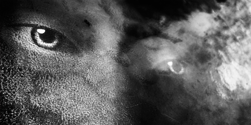
The redux is in B&W accenting the shapes and textures whereas the original is in color and has those haunting, hypnotic eyes. The framing of both is the same with the long rectangular shape that helps keeps the focus centered on the eyes without any distractions. The original has just something piercing about the eyes that this redux just doesn't quite capture. The eyes are looking away instead of staring straight at the audience. I think it would improve the visual impact if both eyes had sharp details - the one on the right loses alot of details due to the haze/overlay when it could have the same possible 'look into the soul' clarity as the eye on the left.






 Add photograph to your favorites
 Add photographer to your favorites


 Photographer found comment helpful.


