| Author | Thread |
|
|
01/16/2003 10:08:36 PM |
Critique Club Critique
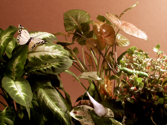
(1) COMPOSITION (CONTENT) - Generally very busy for a photo. The title does make me look for the various elements. But I have too much to look for, no one subject to grab me. Your key elements are very spread out.
(2) BACKGROUND – The wall in the back is a good choice. Good color, with no structure to it.
(3) CAMERA WORK ,TECHNICAL – The lighting is too uneven - a little too bright from the right side. The rest of it seems ok. A good choice of aperture, so DOF is good. Looks in focus to me. The cocoon is soft, so might appear out of focus to some.
(4) DIGITAL PROCESSING ,TECHNICAL – no recommended changes
(5) MY OPINION ON THE PHOTO – I think you picked too hard a song title to produce a great picture. You have all the elements present, so technically you have it – it just becomes very busy to look at. You got the “circle of life” here, but its hard to see it.
Jim msp
|
|
|
|
01/13/2003 12:35:30 AM |
|
I case you missed it..."Circle of Life" :-) |
|
Comments Made During the Challenge  |
|
|
01/12/2003 06:10:42 PM |
|
There seems to be a bit of noise in this picture. Using a program like neat image would really help out. Also, I think the application of an unsharp mask on this image would really improve it. jgillard6 |
|
|
|
01/12/2003 05:55:37 PM |
|
there is way too much going on in this photo and the hue in this picture is not the greatest |
|
|
|
01/09/2003 07:19:54 PM |
I really don't see this as a song title, but my lack on knowledge shouldn't hurt your photo, so I'm going to take your word for it, but doesn't it seem like a long title? Took a long time to find the catapiller, hidden in the greens. (Joke - even faked the caccoon? sorry, couldn't resist) Photo quality overall is fairly good. Glare on the catapiller probably not so good of a thing. Caccoon seems least real of all and easily missed. Background - not bad, it doesn't take away from the picture, but adds to the sterility of the shot (fake look). Even the butterfly looks a bit fake.
(I'm really sorry, but I'm trying to be as honest and kind as possible.) 6 Swash |
|
|
|
01/09/2003 07:06:33 AM |
|
great idea but the viewer has to work hard to find the subjects. |
|
|
|
01/07/2003 12:10:45 PM |
|
|
|
01/06/2003 10:22:52 PM |
|
Two comments: 1) The pic seems a tad out of focus, 2) I don't see a focal point. My eye is attracted to the butterfly, but its location isn't the best. |
|
|
|
01/06/2003 07:21:33 PM |
|
|
|
01/06/2003 06:56:28 PM |
|
not the best light, just a little harsh to the right side. |
|
Home -
Challenges -
Community -
League -
Photos -
Cameras -
Lenses -
Learn -
Help -
Terms of Use -
Privacy -
Top ^
DPChallenge, and website content and design, Copyright © 2001-2026 Challenging Technologies, LLC.
All digital photo copyrights belong to the photographers and may not be used without permission.
Current Server Time: 06/28/2026 04:28:20 AM EDT.