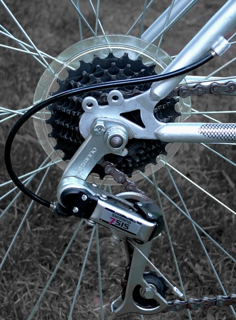
It does depict complexity for sure, but the image itself doesn't really have that kick to it which makes stand out from the pack. I probably wouldn't have shot this straight on but chosen a different angle and definitely a different background.
wonderful idea but the picture just doesn't please the eyes. i think this idea could have been taken further with maybe a different background and lighting... keep up the good work! it's so fun to learn more techniques and tips and this website provides a lot of help
Gears? Complex? Aren't they classified as simple machines? ;) Alright, I'll stop being a geeky engineer and look at this photo as a photographer. The composition is very good and well balanced. The only thing I would change is to give the bottom of the derailleur a bit more room. It's looks somewhat crowded with the close crop. Also, the spokes just left of the derailleur look a tad out of focus and some others (along with parts of the frame) are refelcting too much light. But believe me, I know how hard it is to not get bright reflections when photographing round metalic objects. As far as the color of the grass, I suspect you may get a few comments about it not being green. Personally, I like the desaturation. It gives the grass a metalic feel that ties it in nicely with the subject.
An interesting idea but one that falls compositionally short. A more interesting angle, something unusual in the lighting or shadows, a macro or a more compelling crop - any of these ideas might have taken this "good photo" and turned it into a compelling entry.





 Add photograph to your favorites
 Add photographer to your favorites


 Photographer found comment helpful.


