| Author | Thread |
|
|
01/14/2003 03:01:29 PM |
Critique Club Critique
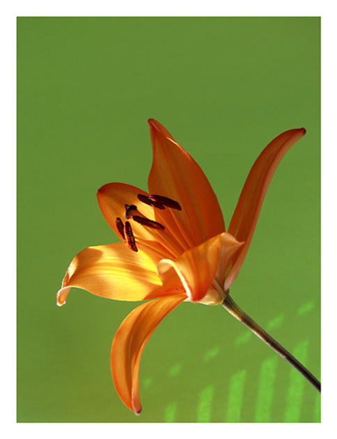
(1) COMPOSITION (CONTENT) Very well composed. The negative space at the top is very refreshing in this composition. It seems to give the flower room to stretch. I like how the stem of the flower is such a strong diagonal line leading the eye right to the sun marks on the wall.
(2) BACKGROUND the background is a very unusual shade of green which definately adds to this photograph. it almost looks "soft" if that makes sense.
(3) CAMERA WORK ,TECHNICAL Exposure is good. Composition is very strong. The details in the pedals and stamins is incredible. Very sharp and crisp.
(4) DIGITAL PROCESSING ,TECHNICAL The white border was a very good choice for this photograph. It adds to the light airy feeling of the flower and the negative space at the top.
(5)MEETING THE CHALLENGE This photo does a very good job of meeting the challenge. I might have suggested putting the name of the group into the title for those of us that are getting senile, and can not remember. (Yes I know it was the Beatles, but not everyone might know that).
(6) MY OPINION ON THE PHOTO A better than average flower photograph. It seems I have not added any ways to make this photo better, but in all honesty, I think its about perfect the way it is.
|
|
Comments Made During the Challenge  |
|
|
01/12/2003 06:16:50 PM |
|
excellent composition, nice background choice, and good clarity |
|
|
|
01/10/2003 01:55:24 PM |
|
so how does this relate to then sun? Otherwise it's an excellent photo. |
|
|
|
01/09/2003 09:09:24 PM |
|
very nice and and clean image. the lighting works for me. |
|
|
|
01/09/2003 05:04:37 PM |
|
crisp colour, like it so much. |
|
|
|
01/08/2003 08:19:31 PM |
|
simple, elegant and expressive. I wonder what this would look like on a black background. may add to the "sudden rise of the sun" effect. but I like the colors. Just wondering. |
|
|
|
01/07/2003 09:16:58 PM |
|
No a huge fan of flowers .. but I like that one a lot. Did you try a square shape ? I am not sure the empty space bring that much or at least not all of it . I like the llight projection (even without the song title theme) except maybe the part more of the left, very close to the petal. Very nice colors, unusual green (I like that) . Congrats. 8. Lionel |
|
|
|
01/07/2003 01:15:56 PM |
This is a great photo. I was tired of the tipical shot with a "great DOF" with the other flowers or plants outdoorish backgrounds. This choice of focus and DOF is very aesthetic, and the background color is excellent for this subject. I also like the shadow&light detail from the blinds in the lower right corner.
I would only leave the black line as frame, and get rid of the white frame; the flower could then have been a little closer to my eyes. The cropping is very consistent with your style, and it provides a clean and handsome composition.
This has more of an afternoon feel, so it would rather be "there goes the sun" :) |
|
|
|
01/07/2003 10:31:52 AM |
|
Wonderfully lit and compsed flower, I especially like the subtle shadows in the bottom right corner that break an otherwise solid green background. Perhaps it would have more impact with the flower in general being more evenly lit, and although I like having the least amount of negative space possible, its a personal preference. Very well executed! |
|
|
|
01/06/2003 09:41:19 PM |
|
The background color works really well with this. |
|
|
|
01/06/2003 05:35:36 PM |
|
|
|
01/06/2003 12:43:03 PM |
|
Excellent. I even love the play of light at the bottom! |
|
|
|
01/06/2003 11:59:17 AM |
|
Beautiful picture. Not sure how it relates to your title. |
|
|
|
01/06/2003 10:18:24 AM |
Crop the flower to you cannot see it all, centering leaves nothing to the imagination.
Lighting good and the angle of the flower and shadow work for you. |
|
|
|
01/06/2003 09:38:55 AM |
|
Beautiful photo of a beautiful flower wonderfully done. Could have been cropped down more on the top. The empty space adds nothing. But there are better ways to show the sun coming. Beautiful photo is a 9 but for the challenge it is a 6. PTL |
|
Home -
Challenges -
Community -
League -
Photos -
Cameras -
Lenses -
Learn -
Help -
Terms of Use -
Privacy -
Top ^
DPChallenge, and website content and design, Copyright © 2001-2026 Challenging Technologies, LLC.
All digital photo copyrights belong to the photographers and may not be used without permission.
Current Server Time: 06/28/2026 08:26:23 PM EDT.