Hmmm... Even if I did trust you, I'm pretty sure you this image isn't your finest photographic hour! Stick a dark vignette, some grain, a contrasty monotone presentation on those digits and it might fly, but.... ;-)
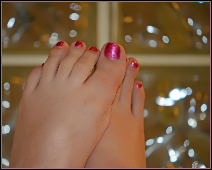
I agree with the title, although this shot doesn't majorly pop for me. The tones overall are a bit too warm and the light isn't interesting. The main distraction is the big blown-out spot on the right side of the shot, it looks like there's tinsel or some kind of metal that's catching the light (possibly the texture of the window glass?) which very much takes my eye away from the feet. Nice nail polish though!






 Add photograph to your favorites
 Add photographer to your favorites


 Photographer found comment helpful.


