Voted earlier coming back to comment.
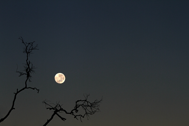
This is such a great example of minimilism - visual haiku. This is such a good capture but I think if you attend to three things that this would be even more stunning. First off, there is a lot of noise - I think it could use a pass in a denoise program to get it more 'clean'. Second, there is too much negative space off to the right that does not complement the composition. It also 'distances' your audience rather than bring them closer to your main subjects. I think that this would work fabulously with a square crop. Third may or may not be possible but if you have the crop space I think it would create a symmetrical balance if the two branches rising out of the sides are equidistant from each other with the bottom left corner being right in the middle of them. |







 Add photograph to your favorites
 Add photographer to your favorites


 Photographer found comment helpful.


