| Author | Thread |
|
|
03/08/2013 12:37:06 AM |
|
masterful match of title and photo. |
|
 Photographer found comment helpful. Photographer found comment helpful. |
Comments Made During the Challenge  |
|
|
03/07/2013 11:23:44 PM |
|
| Photographer found comment helpful. |
|
|
03/07/2013 06:33:56 PM |
|
The tones and tilt add to the story.... |
|
| Photographer found comment helpful. |
|
|
03/07/2013 01:39:11 PM |
|
I really do like this one -- can't vote though... :( |
|
| Photographer found comment helpful. |
|
|
03/07/2013 12:20:59 PM |
|
| Photographer found comment helpful. |
|
|
03/07/2013 04:07:25 AM |
|
| Photographer found comment helpful. |
|
|
03/05/2013 03:09:30 PM |
Voted earlier coming back to comment.
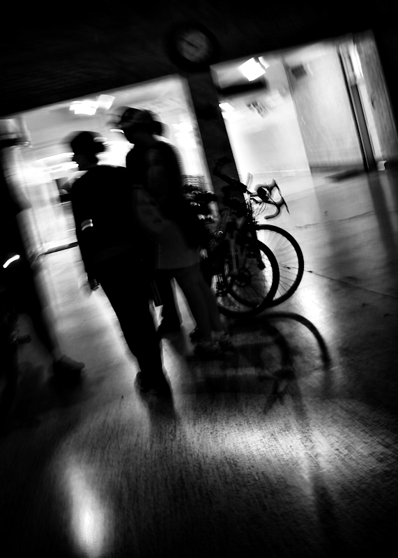
Very clever turning this street picture of people and transportation into a study of lines and shapes. The two people are the leaning lines of the title while the bicycle wheels are the circle o's of the title. B&W was the better choice because the bold contrast between light and shadow can be accented/played up more. Color would not have been as effective in calling attention to the lines and shapes here. My one critique is that I think there is a bit too much negative space on the top and the bottom. I think it would draw the viewer in much more and have the main subjects be more of the main focus if it was a square crop. |
|
| Photographer found comment helpful. |
|
|
03/03/2013 11:08:17 PM |
|
dizzying movement in this. instant favorite. |
|
| Photographer found comment helpful. |
Home -
Challenges -
Community -
League -
Photos -
Cameras -
Lenses -
Learn -
Help -
Terms of Use -
Privacy -
Top ^
DPChallenge, and website content and design, Copyright © 2001-2026 Challenging Technologies, LLC.
All digital photo copyrights belong to the photographers and may not be used without permission.
Current Server Time: 06/30/2026 10:14:14 PM EDT.