Voted earlier coming back to comment.
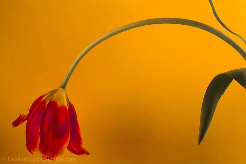
You have many good elements here but it just needs a bit better lighting and a little bit more on the composition placement. First off the lighting is a bit flat that it doesn't allow the tulip to visually pop off that yellow backdrop. Better lighting would add more defining highlights, shadows and tones that are different from the backdrop (one light from above at a 45 degree angle, and one from a below at a 45 degree angle both shining at the head and stem of the flower is what I would try). As it is now, the yellow tones of the tulip in some areas blend in so well with the tones of the backdrop. Second the compositional placement is good but could be a tad better. I like that you have the head of the flower in the bottom left corner in the composition but to create visual symmetry and a pleasing balance to the eye you need to place/get the stem to arise out of the bottom right corner. |







 Add photograph to your favorites
 Add photographer to your favorites


 Photographer found comment helpful.


