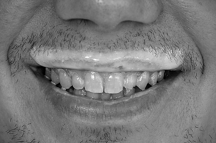
Keep in mind this is a critique of the picture, not of the photographer. Crop - I think you've chosen well for the crop - enough space left, right, top, and bottom - nose gives additional context, even though it is cut off. Vignetting - not enough to be a visually significant factor.
I think three things that really hurt your score are:
No white whites - yeah, I know buttermilk isn't white, but since it is in b & w, you could make it look white. As it is, the "whitest" part of the pictures looks like a very unattractive (even repulsive - especially on teeth) grey.
Lighting - I am no expert on lighting, but the picture's lighting makes this look like a dentist shot, with wet, icky teeth - pulling attention away from the milk-stache.
Stubble - little sprouts of facial hair are not attractive - either clean shaven, or a nicely trimmed mustache would work better.
|





 Add photograph to your favorites
 Add photographer to your favorites

 Photographer found comment helpful.


