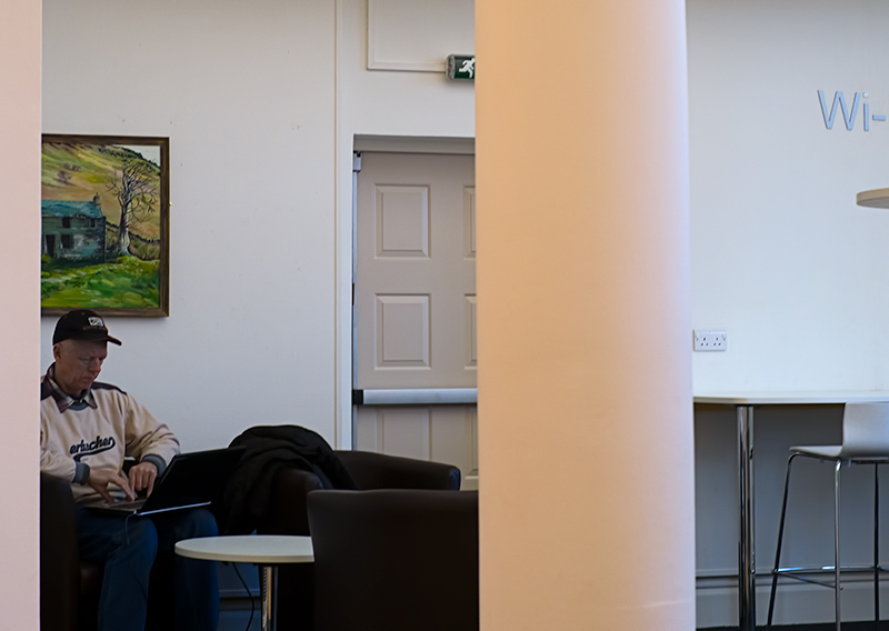
Nice picture of the post. Interesting use of partial objects intruding into the background, but they distract from the central pole. For example, the partial chair, Wi- partial word, shelf edge (all on the right), the partial door (center - especially with the multiple panels), painting, man's shoulder, round table, overstuffed chair (all left). That being said, it is in focus, and pretty much level.
Not sure what the burst of color is that is the offset. The only color that jumps out is the picture over the man's head but the column in the foreground is so distracting that it really annoys rather than enhances the photo. If the column was supposed to be the offset, it has no real "burst" of color.
I like how the colors of the painting make it stand out. The pole (?) in the middle ruins the picture though, IMO. What if you cropped it in portrait orientation, everything left of the pole?





 Add photograph to your favorites
 Add photographer to your favorites

 Photographer found comment helpful.


