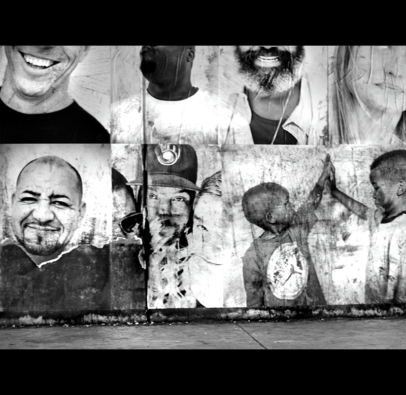
There are poster type murals underneath the bridges in the State Street area of New Haven. I took. Afew shots on the fly out the car window. I was alone. This shot was the most compelling.
The comments were great on this shot. I understand that the shot depicts a mural, but I was never worried about the existing artwork dq possibility. The frame, is preference, but could have been left out on a stronger image.
Wendy hit the nail on the head that the shot needed another person,a live observer to give context and perspective. As it was, I was depicting decay, the fact that the mural was falling apart, what that means for society, the looks the smiles, the children, the city.
So, as I see the shortcomings, as perfectly pointed out, the composition, the lack of a person, the angle of shot and the street that should be included, the processing, the quality of exposure, depth of focus, the shadow detail, the lighting and the sharpness of focus.
Back to the lab again, lots to work on.
here are some outtakes
Statistics
Place: 181 out of 239 Avg (all users): 5.2295 Avg (commenters): 7.2000 Avg (participants): 5.0341 Avg (non-participants): 5.7353 Views since voting: 367 Views during voting: 211 Votes: 122 Comments: 5 Favorites: 0
I really wish there was a person in this shot. It's a great shot, and the processing is quite nice, but it would be so much more interesting and personal with something besides the mural. A person, a dog, a piece of litter, something that anchors it a bit and doesn't make it just about the artwork.
Photographs of a collage of photos are hard to judge. I like the framing of the top row. By cutting the heads off you have added to the "art" of the collage. The bottom row does not work so well. The border is a big distraction. A simple thin black one would have worked better.