| Author | Thread |
Comments Made During the Challenge  |
|
|
10/06/2012 06:38:11 PM |
|
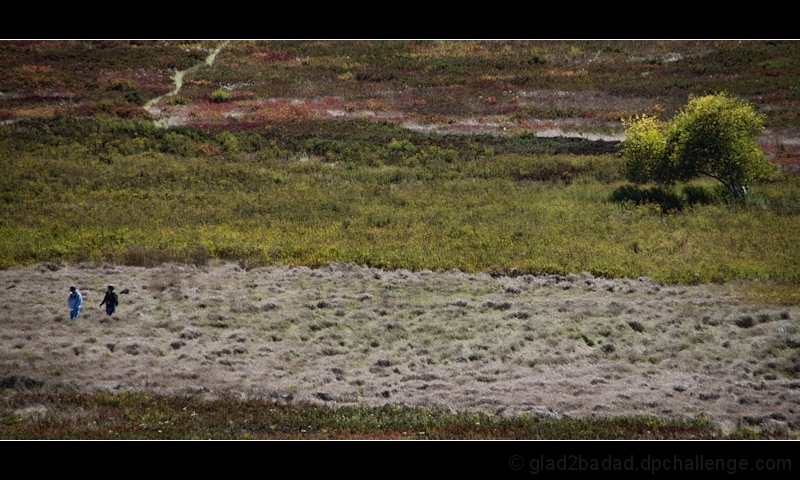
I like all the negative space here, although perahps there is too much. Think about it, your border is 100's of times larger than your two subjects. Maybe there is "tension" present but they are so small not sure I can tell. Title it "Lost" or "We are alone" or somesuch and it might work better. |
|
 Photographer found comment helpful. Photographer found comment helpful. |
|
|
10/06/2012 02:09:07 PM |
|
| Photographer found comment helpful. |
|
|
10/04/2012 09:53:59 AM |
|
I like the wide view and composition. |
|
| Photographer found comment helpful. |
|
|
10/03/2012 08:56:52 PM |
|
border makes the people look even smaller. with only 800 pixels to work with, why shrink the image? gl. |
|
| Photographer found comment helpful. |
Home -
Challenges -
Community -
League -
Photos -
Cameras -
Lenses -
Learn -
Help -
Terms of Use -
Privacy -
Top ^
DPChallenge, and website content and design, Copyright © 2001-2026 Challenging Technologies, LLC.
All digital photo copyrights belong to the photographers and may not be used without permission.
Current Server Time: 06/30/2026 01:20:37 AM EDT.