| Author | Thread |
|
|
09/30/2012 10:58:57 PM |
|
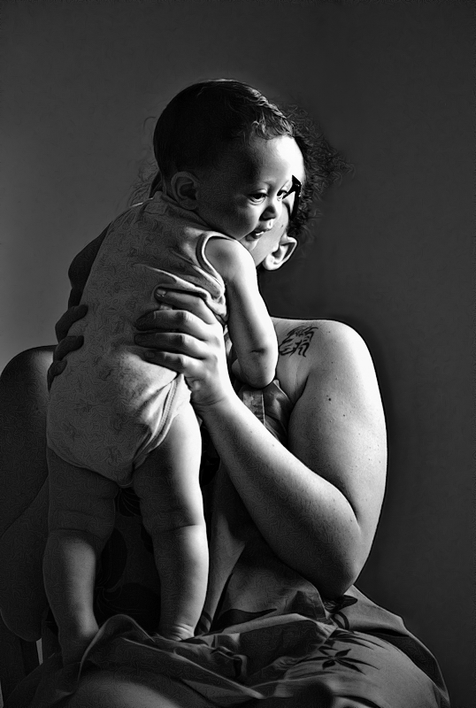
I really don't know what's wrong with it, either. The black and white holds much more emotion, somehow, than the color one. That's my own opinion. I think this is beautiful. |
|
 Photographer found comment helpful. Photographer found comment helpful. |
|
|
09/13/2012 10:20:06 PM |
|
I think the colour version works better because in black and white the baby's face is hard to 'read' against the mother's. |
|
| Photographer found comment helpful. |
|
|
09/09/2012 11:43:54 PM |
The baby's face is exceptional! It's like a Picasso.
I cannot but look at this image as if it's a painting or a drawing, therefore I wish that the mother's arm would fade or be totally in the dark or simply cropped (leave the tattoo on the shoulder though).
I was very impressed by the original image also. I do not want to tamper with your image, but if I were you I would play more with it in terms of cropping the arm. It's a spectacular image. |
|
| Photographer found comment helpful. |
|
|
09/09/2012 05:42:33 PM |
|
For me it is primarily the layering of the baby's face over the mother's that holds this back. I really want to see that sweet baby's profile clearly against the background. Hope this helps. |
|
| Photographer found comment helpful. |
Home -
Challenges -
Community -
League -
Photos -
Cameras -
Lenses -
Learn -
Help -
Terms of Use -
Privacy -
Top ^
DPChallenge, and website content and design, Copyright © 2001-2026 Challenging Technologies, LLC.
All digital photo copyrights belong to the photographers and may not be used without permission.
Current Server Time: 07/01/2026 03:27:49 PM EDT.