|
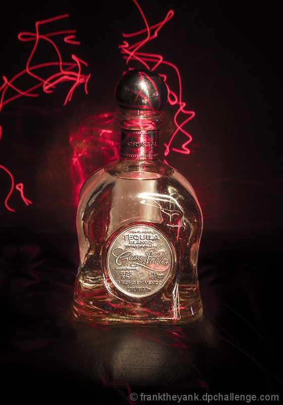
For some reason, this doesn't work for me - I think I don't see any pattern, meaning, or use for the red lighting paths around the top area of the bottle. It also looks like you did some patterns with white light that causes the hot highlights on the label, cap, and "shoulder" of the bottle. I do like the dark background, the red as a contrast. Just seems like someone playing with this & that, rather than having a coherent idea of what they were looking for. |






 Add photograph to your favorites
 Add photographer to your favorites


 Photographer found comment helpful.
