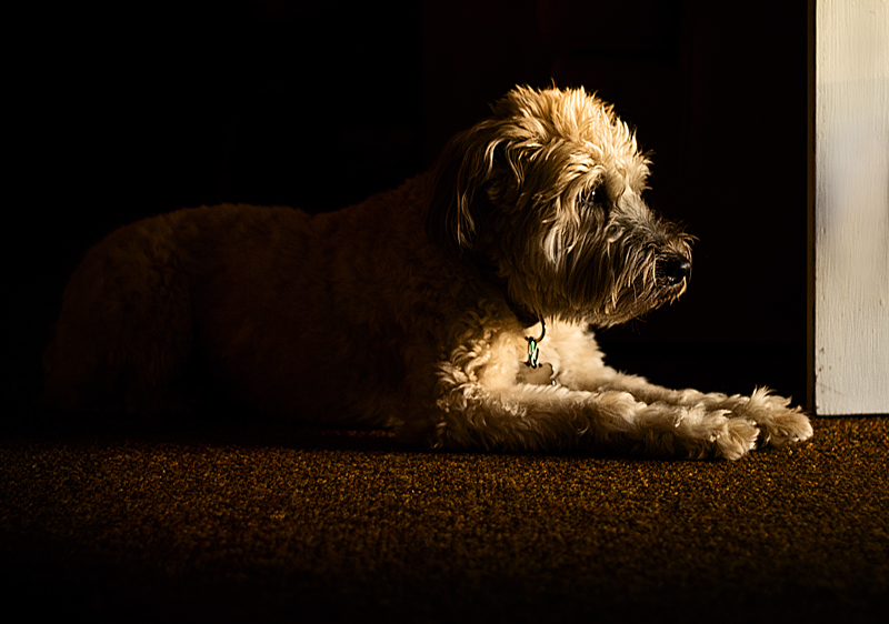
Thanks for the comments. I see some do not like the door. However, as mariuca commented, it was left in an attempt to make it more than just a dog portrait -- the loyal dog waiting expectantly by the door waiting for her master's return. Maybe I should have included more door?
I initially liked the texture of the carpet in the foreground, but I think the comments have convinced me that it draws the eye too much.
Mondrian composition, limited palette (of tones), and the contrast in dog and rug textures warms up the starker contrast between fur and door and black beyond. (I have a very similar, in the bare bones sense, of a friend's dog that I think is one of my best works). Like.
I like the light and the way the dog is looking but that brown rug is ruining it for me. If that was black or a nice hardwood I think that would really improve the sot. And maybe just a touch more light in the shadows. As I continue to look I am also drawn to how the dog is looking out of the frame, it doesn't kill the shot here but better comp with more open space for the dog to look into would help imho.
I feel that the focus is on the carpet rather than the dog. What if you used a gradient blur on it to soften it and then it might not pull the eyes away from the dog? The light is beautiful.
Commenting for the critique thread - I agree with your description of "really nice light". Echoing what others have said, the band of door is really distracting and detracts from the balance. Try cloning that out with the blackness and see if that improves the balance. I also agree with GeneralE that the use of negative space in this shot is really good.
The texture of the carpet and the way it runs through the image is really nice.
I think I'd tone down or just tone (add more color) just slightly to the very brightest highlights on the forehead. Right now they make me focus too much on just that part rather than her whole face.
Otherwise I like the use of light and negative space, pretty good capture of the emotion of the moment.





 Add photograph to your favorites
 Add photographer to your favorites


 Photographer found comment helpful.


