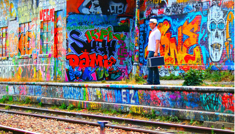
What's sad to me is, there is such a wonderful story here - who is the man and why does he have a suitcase full of cash, and why is he standing on this grotty old platform? Had you rendered this as it was, or even in b/w, it could have placed much higher.
Now PS tools like HDR and the various sliders in saturation etc are fun to play with. And by all means play with them. But the intense colours completely overwhelm the quiet drama played out here. I hope you see that and heed the words that both myself and others have posted.
Cool graffiti, but the saturation is too high on this, especially the reds. His skin almost looks like he has a condition because it's blowing out in the red.
Too contrasty, you lose your subject a little in the background. Unless that was what you were going for? Try a low aperture number to blur out the background. You still get that pop of color, but them your subject stands out more.
The colourful graffiti makes the image very dynamic and guy adds to make a cool story. I just wish the saturation of the man's face and on the tracks had been decreased. It would have looked more natural and make them stand out more.





 Add photograph to your favorites
 Add photographer to your favorites

 Photographer found comment helpful.


