I wish I had controlled a few variables better, the background, Ruby's shirt, etc- but it was cute enough to enter.
After the challenge. I know this was "half assed" in a sense. Sometimes you get lucky and sometimes its a quick thing that you just snap and don't worry about the technicals. I thought about thus too late to plan it any better, and didn't want to stress the family or my number one model by seeking perfection on this one.
Thanks for the comments, hope it brought a smile beyond the average piece of cheesecake.
Statistics
Place: 35 out of 51 Avg (all users): 5.2672 Avg (commenters): 6.5294 Avg (participants): 5.0000 Avg (non-participants): 5.3647 Views since voting: 385 Views during voting: 250 Votes: 116 Comments: 20 Favorites: 0
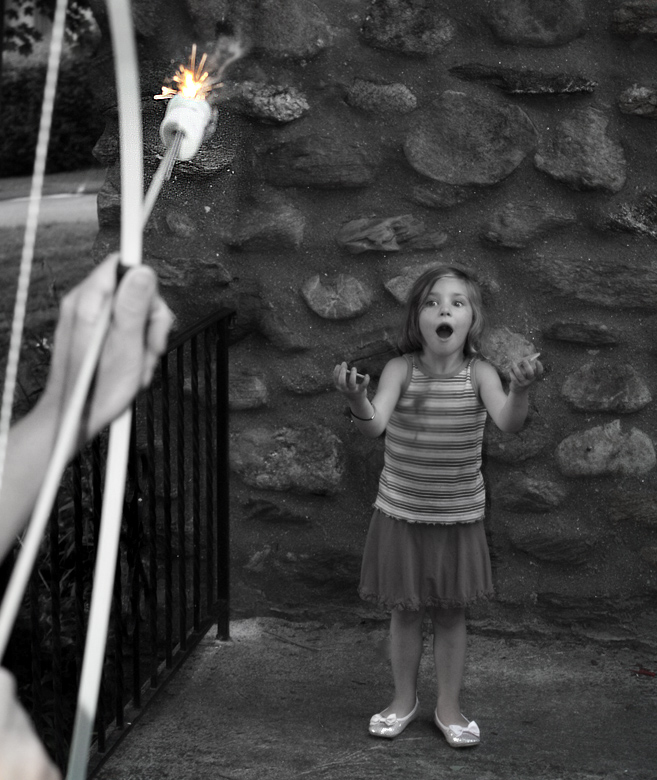
Love the idea. Not a fan of selective desat, but I think it works here. Your model is great! But, I wish the marshmallow was down more in the shot (I know you don't want to point an arrow at her, but just bringing it down a bit would make it more part of the shot, imo. Right now, it's almost an afterthought.
This is a really cute concept and I love the little bit of color accentuating the flaming marshmallow. A different angle between the camera, girl and arrow might have filled in the frame a little more efficiently and you wouldn't have quite as much extra space around the edges.
O.k. this got a chuckle from me - that is definitely one extreme way to make S'mores:-) I do think the little girl would enjoy (and be much safer) the S'mores if held her hands out from her body though (Mom, in me can't help but think safety sometimes) O.K. getting back to the composition - as a humor piece on extreme baking it is amusing - the girl's open mouthed excitement on catching the marshmellow is great. With food photography whose main subject projects 100% that it is all about the dessert it doesn't focus solely on the dessert. There is 'action' in this shot, there is humor in this shot and that is where the main focus lies; that is what captures our attention. The dessert only comprises mayhap 5% of the physical space of the photograph - it has become the supporting cast in the composition rather than the main star that takes front and center. I do think that this composition would be far better suited in a humor challenge or a challenge tht plays to it's strengths.
I like the concept on this one so much! I wish it was more dramatically angled and cropped much more tightly though. There is a lot of space that just isn't really necessary and is distracting to the great elements in the concept. Good use of color for emphasis too.
This is a tough challenge to vote. I'm torn between "what are you trying to do here" and "what do I expect here". Further complicating matters is the question "what would I do here".
What I would expect would be a technically strong piece of eye-candy that would present the dessert in a way that I would want to at least sample it, if not order it. Along these lines I'm looking at technicals: backgrounds, distracting elements, exposure, sharpness. I'm also looking for creativity, imagination, and originality, which can make up for less than perfect technicals.
So, where does this leave me with your image?
Fantastic take on the challenge! Not a fan of the tones used in the desat, though. I understand why you did it, but think it would have come across better if you had mixed the bw with a slight sepia based layer. You still would have been able to make your fire stand out without it being quite so contrasty as to look like a gimmick.
humor is apreciated here while there are some focus issues I like that this is funny it gets one of my higher marks for creativity and thinking outside the box. Thanks for the laugh.




 Add photograph to your favorites
 Add photographer to your favorites

 Photographer found comment helpful.


