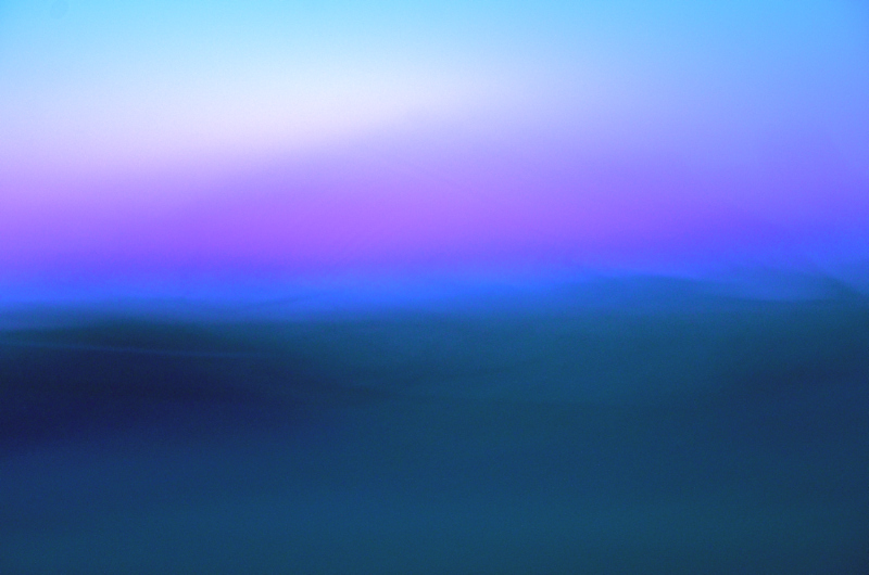
Amazed by this on second view. It is so representational, but it is the opposite as well.
In painting a sky, to stay true to color, it is said to be advised to use cerulean, then cobalt, and then ultramarine as the sky grazes the heavens with purple. Here we have the purple in the middle, the cool sunrise. Sorry so rambling, I enjoyed it. |






 Add photograph to your favorites
 Add photographer to your favorites


 Photographer found comment helpful.


