|
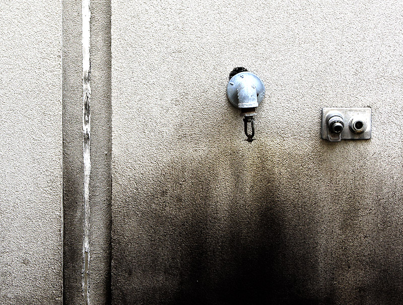
I like where you were going with this. I think some simplification of the scene would have sent this over the top. Removing the left hand side of the photo and focusing on the two objects would have been brilliant, simple and mundane! The joint in the wall adds clutter and doesn't strengthen the image. The composition would then have been light at the top and dark at the bottome to anchor the photo with the two shapes in the middle somewhere to add interest. |





 Add photograph to your favorites
 Add photographer to your favorites


 Photographer found comment helpful.


