|
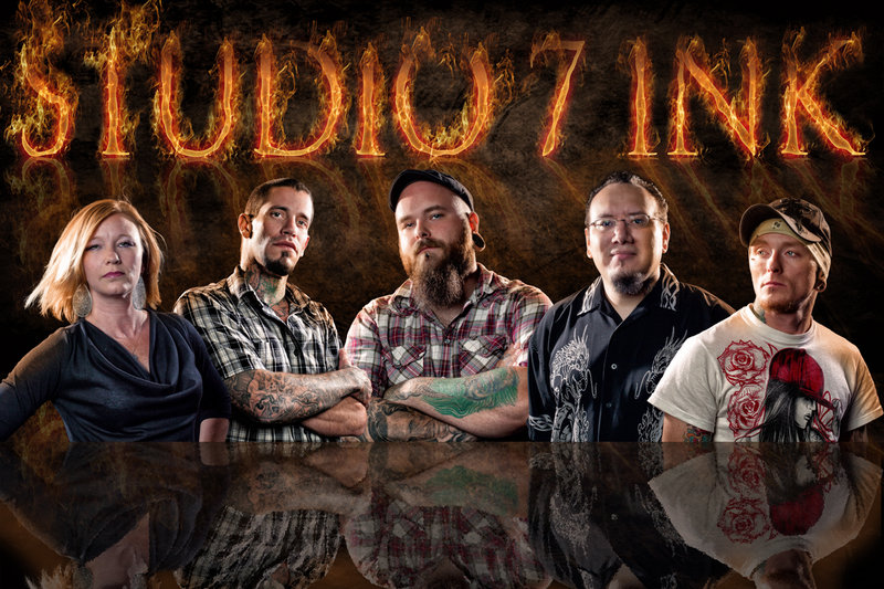
I think you did a great job with the people. The only strange thing I notice is the mirror of the letters. The S-T-U are almost straight up and down. The rest of the letters veer off more and more to the right. Because you have the lighting coming from both sides, this just 'feels wrong.' It seems to be at an angle, when you look at all the lettering together and yet by size, it doesn't. Not sure which was to go, but I don't think it sits well as it is. Otherwise, this is great work! |




 Add photograph to your favorites
 Add photographer to your favorites


 Photographer found comment helpful.
