| Author | Thread |
|
|
04/17/2012 04:37:01 PM |
|
after reading those 3 comments, I think I would bump this to a 7. |
|
 Photographer found comment helpful. Photographer found comment helpful. |
|
|
04/17/2012 03:01:21 PM |
|
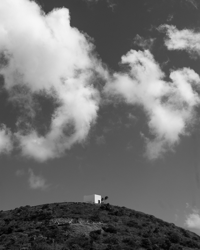
Actually, I think this image could have been improved in certain ways, using dodging and burning. I also don't necessarily have a problem with the composition. The issue for me is that the payoff of the building is just not good enough. It's not a particularly photogenic building, most of it disappears against the sky, which is the same tone. I'd show you what I mean, but this gif is not large enough to edit. |
|
| Photographer found comment helpful. |
|
|
04/17/2012 02:10:11 PM |
Ditto the "I think this one just doesn't stand out". As a thumbnail among interesting and colorful images it would not catch my eye at all. It's just a cube house on a hill.
Technically it's an ok midday B&W image. I have to remind myself that people looking at a photo can't know what is just outside the frame. There may be a gated community just over the hill, or a shopping mall to the left or right for all a viewer would know.
If there was nothing on either side, horizontal and super wide using rule of 3rds and a lower POV to get more foreground into the shot, would probably moved it into a minimalist sort of composition and bumped up the score.
|
|
| Photographer found comment helpful. |
|
|
04/17/2012 01:43:25 PM |
You want honest so here goes. #1 there is too much sky, it overwhelms the image, and I would have chosen a landscape orientation rather than a vertical one #2 I don't think b&w was the best way to go with this photo since it has so much sky I would like to see the blue of the sky and not so much grey. #3 the main subject is very far away and centered in the image, to make this shot more interesting follow the rule of thirds and have it over more to the right or left.
As far as DPC voters are concerned you have about 3 seconds to make an impression I think this one just doesn't stand out enough to make voters stop and pay attention. I didn't vote in this challenge but I probably would have given it a 5, so it looks like I would have been in with the majority of the votes you received.
Also what time of day was this taken, it looks like the middle of the day to me. When you take a landscape shot in the middle of the day you end up with a flat looking landscape. Landscape shots that are taken in the middle of the day are great for snapshots to put in your photo album but usually don't score very well in challenges. Time your photos for morning right after the sun rises or later in the evening at sunset. |
|
| Photographer found comment helpful. |
Comments Made During the Challenge  |
|
|
04/03/2012 09:50:45 AM |
|
Awesome capture! Love the "solitude" feeling portrayed here |
|
| Photographer found comment helpful. |
Home -
Challenges -
Community -
League -
Photos -
Cameras -
Lenses -
Learn -
Help -
Terms of Use -
Privacy -
Top ^
DPChallenge, and website content and design, Copyright © 2001-2026 Challenging Technologies, LLC.
All digital photo copyrights belong to the photographers and may not be used without permission.
Current Server Time: 07/01/2026 12:59:09 AM EDT.