| Author | Thread |
|
|
03/09/2012 04:44:21 PM |
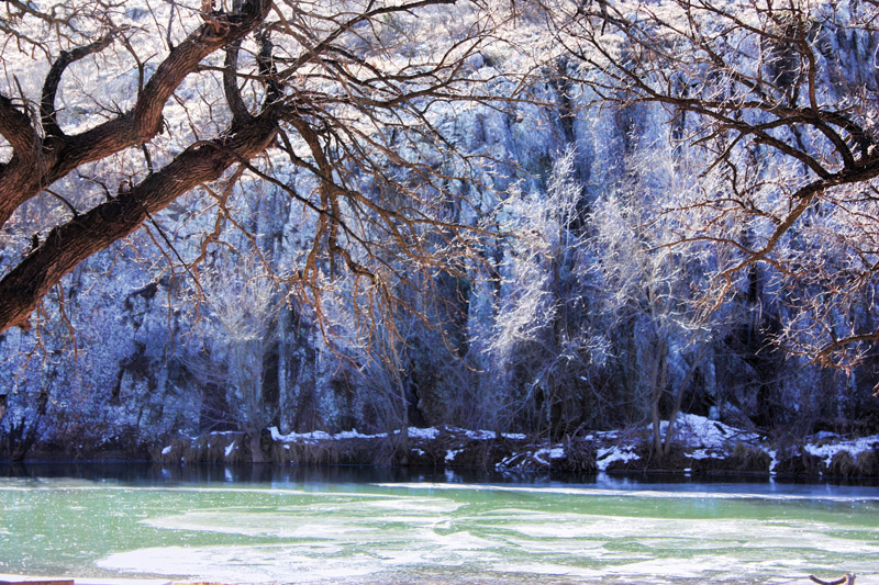
I would crop off a smidgeon more of the bottom there's a couple of distracting things down there.
I like the look of the stuff on the other side of the lake. I wonder about adding a hint of vibrance to bring out the color of the lake itself a little.
Message edited by author 2012-03-09 16:46:12. |
|
 Photographer found comment helpful. Photographer found comment helpful. |
|
|
03/09/2012 04:43:05 PM |
I like the original very much, lack of contrast aside, as there is a neutral quality to the background trees which is very winter-like.
In your PP you have intensified hues for both background and foreground, so both background bluish cast and foreground branches reddish hue are quite evident.
It's a way to go, but personally I find a more neutral rendition more to my taste.
Or alternatively, if you like a saturated version, move slightly the hue for branches, woods and water to make them complement each other more.
Just my 2 cents, but I have weird tastes :)
Nice scene, I'd love to live in a place like that.
|
|
| Photographer found comment helpful. |
|
|
03/09/2012 04:22:54 PM |
|
Not over the top. Which is good, because many of us, myself included, have had a tendency to really overcook images when first trying out tonemapping. Let me see what I can do with it. |
|
| Photographer found comment helpful. |
Home -
Challenges -
Community -
League -
Photos -
Cameras -
Lenses -
Learn -
Help -
Terms of Use -
Privacy -
Top ^
DPChallenge, and website content and design, Copyright © 2001-2026 Challenging Technologies, LLC.
All digital photo copyrights belong to the photographers and may not be used without permission.
Current Server Time: 06/03/2026 07:43:51 PM EDT.