| You are not logged in. (log in or register) | |
|
|
|
How'd They Do That? :: Love
Love by Konador
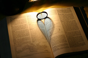
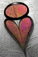
When you're trying to make "Love" there are a number of stages you need to follow, and each stage has its own set of problems. By following this tutorial, you should be able to make your own "Love" as good as possible. I have split the stages up and created a quick menu which will take you to the area that you are having problems with. If you've never tried making "Love" before, you should read the whole tutorial through, beginning to end. "Shall we leave the light on?" "It's all deformed and stuff!" "It's too big!" or "It's too small!" (Pick whichever is relavent to you) "Now it's gone a strange colour!"
|
 |
 |
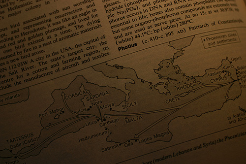
As you can see, cutting out ambiant light strengthens the shadow, and reduces the number of secondary shadows within the main one.
 Next
Problemo:
Next
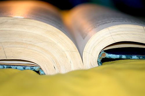
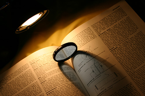
Problemo:There could be a couple of different reasons why your heart looks the wrong shape. One is the shape of the book. The curve at each side of the book's spine needs to be roughly the same. On the example to the left, I pushed down on the right hand page, creating a flatter surface. This skews the heart and makes one side of it uneven.
If the light source isn't exactly central to the spine, then the pages need to be adjusted. The best way to do this is by eye, as only you know how you want the heart to look.
The advantage of using an old book with a broken spine, is that it gives you more control over the curves. A newer book would have the tendancy to spring back into its natural position, which may not be how you want it.
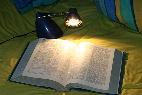
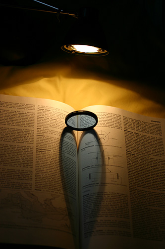
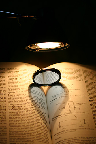
Another problem is getting the heart to not be too squashed or too streched. This is controlled by how near the lamp is to the filter. The closer and higher it is, the shorter the shadow will be, the same way that shadows at midday are always small and shadows in the morning or evening are always really long. The two photos below are examples to show the difference the position of the lamp can make.
 |
 |
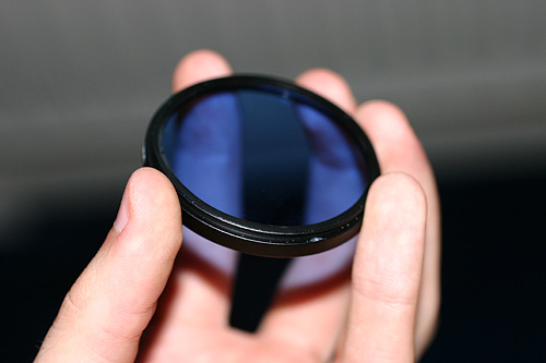
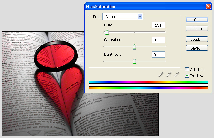
Leaving the camera on AWB (Automatic White Balance) will create photos as seen in all the examples so far. They look nice, but it does create a problem. The heart looks blue, but only because it is next to the yellow pages. If you go into the Hue/Saturation settings in Photoshop, and boost blue and cyan to the max Saturation, it shows that in fact the filter is just making everything grey, and it is not blue at all (as shown in the image below). This makes sense, as it is what the skylight filter was designed to do in the first place - neutralise tungsten light.
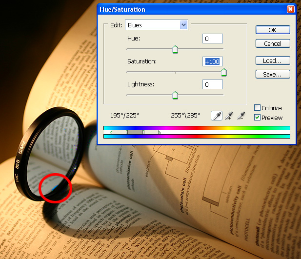
 As
you can see above, only one part of the image was effected by the saturation
boost (circled in red), and that was the Blu-Tak I used to hold the filter in
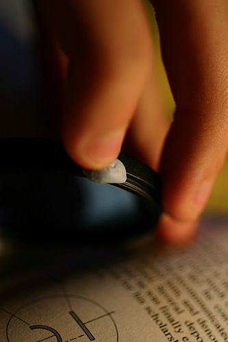
place! To correct this, a custom white balance needs to be set. I took a photo
of the page in the same lighting as the final shot would use, and set this image
as the custom white balance. With the 300D, this is done by going into any manual
mode (P, Tv, Av, M, A-DEP), pressing the MENU button, then scrolling down to
Custom WB, and pressing SET on the image you want to use as your "white".
On other cameras, it is probably done in a similar way, but you should check
your manual for more specific instructions.
As
you can see above, only one part of the image was effected by the saturation
boost (circled in red), and that was the Blu-Tak I used to hold the filter in
place! To correct this, a custom white balance needs to be set. I took a photo
of the page in the same lighting as the final shot would use, and set this image
as the custom white balance. With the 300D, this is done by going into any manual
mode (P, Tv, Av, M, A-DEP), pressing the MENU button, then scrolling down to
Custom WB, and pressing SET on the image you want to use as your "white".
On other cameras, it is probably done in a similar way, but you should check
your manual for more specific instructions.
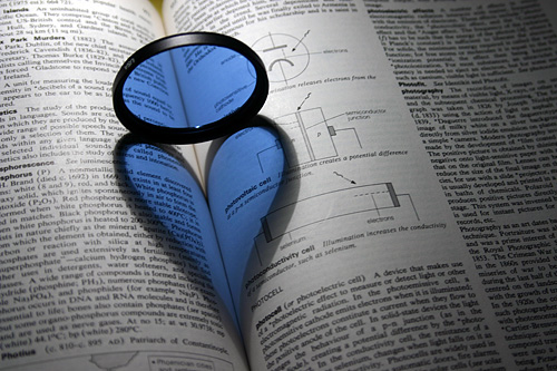
Using the image on the left as my white balance setter, the photos taken afterwards look much more pleasing, as you can see below:
We are nearing the end of this journey, weary travellers, but one more obstacle still stands before us.
When you go into the blue channel in Photoshop now, you should be able to change the colour of the filter. Move the slider up and down and watch the colours. Woooo psychedelic! Notice anything though? The colours only range from green to pink. No red! I'm no Photoshop expert, so I have no idea why this is, but in this case it's quite annoying. When changing the Master channel, it can go to red, but then if you have any other colour in the photo, that changes too. To overcome this little set-back, you just need to do the hue adjustment in 2 stages.
 In
the first stage, you have to go quite far over to the left with the slider,
but you must also make sure that all the colour is in one channel. In the example
above, I've made sure the heart is all green. If I moved the slider all the
way over, instead of stopping at -100, the next stage wouldn't work. Sure, it
would still look all green, but there would be certain shades which would have
moved into the yellow channel. In the next stage, when you try to move the green
channel over to red, you would get the effect pictured on the right.
In
the first stage, you have to go quite far over to the left with the slider,
but you must also make sure that all the colour is in one channel. In the example
above, I've made sure the heart is all green. If I moved the slider all the
way over, instead of stopping at -100, the next stage wouldn't work. Sure, it
would still look all green, but there would be certain shades which would have
moved into the yellow channel. In the next stage, when you try to move the green
channel over to red, you would get the effect pictured on the right.
To make absolutly sure that this doesnt happen in your final image, you have to try it a few times until you find the right position on the slider depending on the original colour of your photo. In my case, the green was the only colour on the photograph (after I changed the yellow channel to Lightness -100), so I could then just change the master channel.
After that, all I did was to crop, sharpen slightly, do a slight Brightness/Contrast alteration, and add a border. Yay, finished!

| Rate This Tutorial!
0 = Not Helpful up to 3 = Very Helpful. NR = No Rating.
Questions? Feedback? Join the Discussion on this Tutorial |
 Love
Love