| You are not logged in. (log in or register) | |
|
|
|
How'd They Do That? :: From Chaos into Calm
From Chaos into Calm by Konador
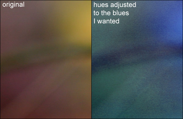
For this challenge, I wanted to try something a bit different from the norm, and I thought it might be a good opportunity to try something a little abstract. My original idea, which didn't work out, was to take a sheet of glass, and put it perpendicular to the camera lens, so it became almost invisible. I then planned to do a water splash on the glass, which would appear to come from nowhere. I would have titles it "Invisible Boundary" or something along those lines. I soon found out though, that I couldn't find glass thin enough to appear invisible. Through experimenting with my original idea, I came up with my idea that I used for my entry. I wanted to show the boundary between sanity and insanity, and how easily it is to cross, but in an abstract way. I'm not sure if my message got put accross successfully, but I think I ended up with a nice abstract photo. First of all, I took this photo in my garden, but I didn't want the normal boring green colours that are present there. I could have adjusted it in post processing, but hue adjustments in multi-coloured, out of focus background, normally become degraded in quality, take this part of a photo for example:
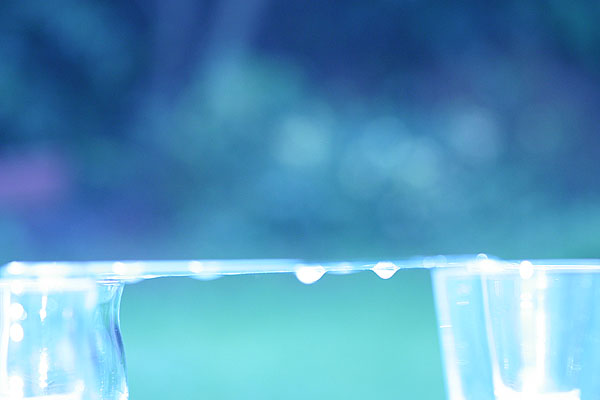
As you can see, there is much more noise in the edited version. To overcome this problem, I took a photo of a white board, lit by artificial light inside my house, and used this photo to set a custom white balance. You could also use the tungsten setting if you don't have a custom white balance selection on your camera. Experiment with different white balances to get different colours. Setting up this custom white balance tricked the camera, and meant that the photo straight out of the camera was blue and green, just how I wanted it. It is much easier to take the photo in RAW mode, if your camera supports it, and manually select a white balance once you have the photo on your computer, but I prefer shooting in JPG mode. Once I'd got the colours to how I wanted them I went back to my sheet of glass, which I had balanced on 4 drinking glasses. I set this up as far away as possible from the background (the back end of my garden) so that the background would be more out of focus in the photo. This should should give you a small idea of my setup, but I didn't think to take any normal photos of it for this article.
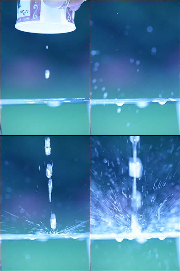
From this shot, it looks like nothing is in focus. I used manual focus, and set it to be focused around about the middle of the sheet of glass. This focussed bit is hidden by the edges of the glass, which are out of focus. I wanted a narrow depth of field, so that the background was blurred, and so that the border line that you see in the final photo was also blurred. This carries along the message that I was trying to give out, about sanity and insanity. It also meant that I could make to two separate elements of my photo even more seperate, but having the calm, sane, part out of focus, to hide any harsh sharpness it had. As you can also see, there are a few drips already hanging off the glass, because it was raining. This didn't effect the final shot, and might actually have helped. Now, the technique to get the actual shot. Firstly, I slowly poured a mug of water onto the surface of the glass, so that I wouldn't get too many splashes off of it in the next stage. I then poured a stream of water onto the glass from a height, and let this water displace the puddle off the edge of the glass. Now, instead of simply falling off the glass at the edge, the water stuck to the glass and made its way underneath to the middle, right where the camera was focused, and then dripped down. How did I know this would happen? Take a look at the rain drops in the test shot above. They did the same thing. From doing a few more tests I found that the more water that I pour on in a short amount of time, the more violent the drops underneath seem, and because it was supposed to symbolise insanity, I wanted them to look quite violent. It was quite difficult timing the shot, and getting the right high when pouring, as these next few outtakes show:
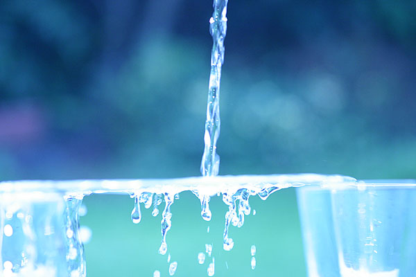
Finally I managed to get the timing and the height correct, and ended up with this shot:
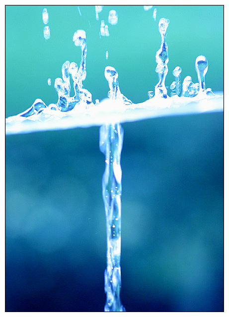
I didn't like the angles of the water or the drips, so I rotated to make them vertical, and then cropped. I wanted to do something a bit different so I decided to center the falling water, rather than place it on a third line. This made a nice pattern in the composition I think.
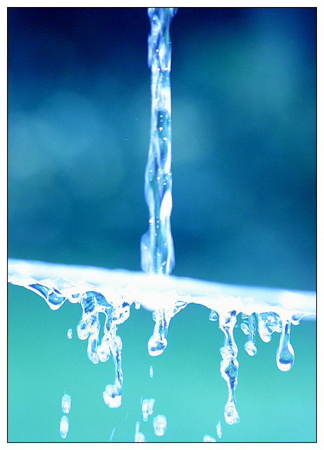
The only post processing I did after this was to do a simple brightness/contrast adjustment of -10/+10, and adding a border. That gave me this shot:
I liked this shot but I thought it looked a bit too normal, and people would just think, "Wow, he poured water onto some glass, how amazing!". That is all I did, but that's besides the point. I decided to see what the shot would look like when I flipped it along the horizontal axis, and I was pleasantly surprised at the result.
To me, it looked like a normal splash at the top, like I had dropped something into a pool of water, and then a nice uniform stream flowing down inside the pool of water. It seemed quite surreal, and because the top looked like a splash, I thought that some people might not realise that the photo was upside down. I was hoping people would ask, "How'd They Do That?" |