| You are not logged in. (log in or register) | |
|
|
|
How'd They Do That? :: Red and White
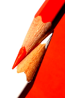
Red and White by RemieI for one, was pleased that the subject for this weeks challenge was "Pencil". Not because I'm a pencil-freak, but because I liked the idea that everybody had to use the same object and therefor was encouraged to come up with something creative and original. My goal was to make an original photo with a strong color-contrast. At first I tried some shots with a single pencil on single-colored backgrounds, but they didn't have the visual impact I was looking for. I got the idea to use two different backgrounds, divided by pencils of the same colors, while shifting a red sheet of backgroundpaper on top of a white one. The setup for the photo is shown on the photo below: 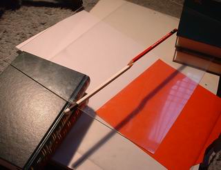 The improvised glass-table is made of the glass is from a photoframe (cleaned on both sides with windowcleaner to remove all dust and fingerprints), resting on two piles of books. By adding or removing books from the piles, I can adjust the height of the surface. I used a 150W videolight at the right side of the scene as the main lightsource. It was positioned in a way that the shadows casted on the background would not be visiable on the final cropped photo. After positioning both the pencils and the light, I adjusted the position of the sheet of red paper untill it was in line with the pencils. The camera was set to macro mode, using autofocus, flash turned off, whitebalance manually set to incandescent light table to compensate for the orange glow of the videolight and exposure compensation manually set to +0.3 EV resulting in a sligthly overexposed photo. While slightly repositioning both the sheet of red paper and the videolight, I shot a couple of photos. I found the one shown below the most suitable to use (original size 1600x1200): 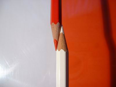 To compose/crop the photo, I find it easiest to open a new blank document in my photo-editor and then paste the photo as a new object/layer. I then resize/rotate this layer untill I'm satisfied with the result. There are other ways to get to the same result, but this is my favorite way. At first I tried an image size of 480x640 pixels, but somehow I couldn't find a good balance between the pencils and the amount of background. A size of 427x640 worked out much better. The yellow rectangle in the illustration below, shows how the final photo was cropped from the original photo: 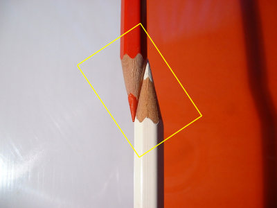 Resulting in the following photo: 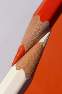 I was very satisfied with the compositon, but the photo didn't have the impact that I had in mind yet. I wanted the colors to be much brighter and more contrast. I achieved this with photoshop, by adjusting the levels (34/1,00/180) and the contrast (+18). The effect is best seen with the unaltered and improved photo next to each other:
And here's the final photo: 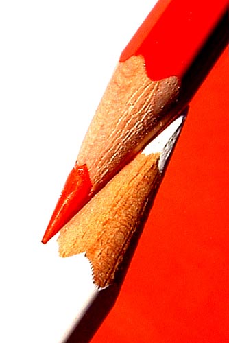 I also made a photo with a black and white pencil on which both pencils blend into the background. Personally I think it has a more "classy" look, but it doesn't have the depth and visual impact of the Red and White one. But you can judge yourself: 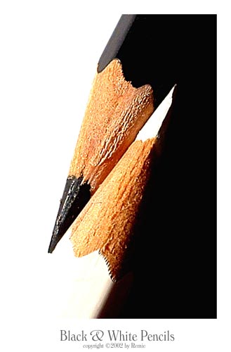
Home -
Challenges -
Community -
League -
Photos -
Cameras -
Lenses -
Learn -
Help -
Terms of Use -
Privacy -
Top ^
DPChallenge, and website content and design, Copyright © 2001-2026 Challenging Technologies, LLC. All digital photo copyrights belong to the photographers and may not be used without permission. Current Server Time: 06/16/2026 09:11:36 AM EDT. |
 Red and White