| Author | Thread |
|
|
08/10/2009 05:55:09 PM · #1 |
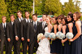
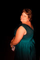
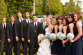
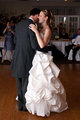
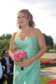
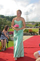
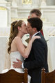
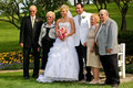
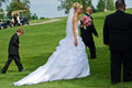
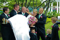
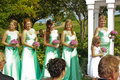
Still fine tuning my setup with monitor trying to get the brightness just right as well as color. Can you take a look at these photos and quickly comment on whether they look about right or not? I know it can be fairly subjective but I'm just looking for an idea of how close I am.
Don't pay attention to the pixalation in a few of the shots.
1.
2.

3.
4.
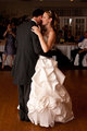
Was hoping to give this one some punch on the bride and groom
5.
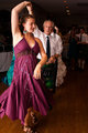
Was hoping to give this some punch on dancers
Message edited by author 2009-08-10 17:57:35. |
|
|
|
08/10/2009 06:11:44 PM · #2 |
|
|
|
08/10/2009 06:38:41 PM · #3 |
There seems to be a slight red color cast to the images.
What are you using to calibrate your monitor? |
|
|
|
08/10/2009 06:40:15 PM · #4 |
Made a quick adjustment on screen gamma, does this look better? Or do I need to go one step further?
Original
Re-edit
 |
|
|
|
08/10/2009 06:59:29 PM · #5 |
Made some adjustments to the bride / groom photo. See what you think.

This is what I did in CS3.
add color balance adjustment layer...
highlights red/cyan channel -21, magenta/green channel -3, yellow/blue channel +9
midtones red/cyan channel -6, magenta/green channel +3, yellow/blue channel +13
shadows red/cyan channel -21, magenta/green channel -8, yellow/blue channel -7
Add exposure adjustment layer...
gamma correction to 1.17
add new soft light layer at 50% opacity....
choose brush tool and set to opacity to 60%, flow to 100%
Paint black onto his jacket, paint white onto the remainder of the groom and bride except for the grooms pants.
double click the color and choose a color with the following settings, hue-0, saturation-40, brightness 100, red-255, green-153, blue-153 click okay then paint on the skin especially in the highlight areas.
That's the process I used if you like the way it looks.
|
|
|
|
08/10/2009 07:00:32 PM · #6 |
| What was done to the image? If only to the screen gamma and not really a change to the image (i.e. curves, color balance etc) then they're really the same image. They just may look different on your monitor. |
|
|
|
08/10/2009 07:04:19 PM · #7 |
| I tried doing something with the lady in the green dress and your group shot but the files are too small for me to do anything. |
|
|
|
08/10/2009 07:04:51 PM · #8 |
Originally posted by cpanaioti:
What was done to the image? If only to the screen gamma and not really a change to the image (i.e. curves, color balance etc) then they're really the same image. They just may look different on your monitor. |
No, I readjusted White Balance from Shade to Cloudy after adjusting gamma because once I adjusted Gamma I saw more red.
If you look at the center subjects you can see the change between the two |
|
|
|
08/10/2009 07:08:17 PM · #9 |
Originally posted by drewhosick:
Originally posted by cpanaioti:
What was done to the image? If only to the screen gamma and not really a change to the image (i.e. curves, color balance etc) then they're really the same image. They just may look different on your monitor. |
No, I readjusted White Balance from Shade to Cloudy after adjusting gamma because once I adjusted Gamma I saw more red.
If you look at the center subjects you can see the change between the two |
To ensure that no real color cast exists, selecting the black, white and grey points in the curves dialogue would do it most accurately. Also, curves gives you the most control over color.
If curves isn't available then do the same in the levels dialogue. This is easiest done by first adding a threshold adjustment layer and using the eyedropper tool to select the point that is most black and most white. The grey point is where each of the RGB values are 128.
See the tutorial on removing a color cast.
Message edited by author 2009-08-10 19:09:23. |
|
|
|
08/10/2009 07:25:13 PM · #10 |
Is there any way of doing that in Lightroom. I have photoshop but I would hate to have to bring every photo into Photoshop.
Boy I hate being colorblind. I tend to get things close but it's the subtle differences. I can see a differnce in the shots but why I don't go for those changes myself is my problem.
By the way, this is what I got in Lightroom after looking at the one shot of the bride and groom.
Original
Redo number 2
 |
|
|
|
08/10/2009 07:33:43 PM · #11 |
| can you send me the original of the bride and groom so I can put it into lightroom and see what I can do? I never honestly know til I try it. Once I do I'll give you the steps I took so you can do it to the rest of the photos. |
|
|
|
08/10/2009 07:34:25 PM · #12 |
Originally posted by drewhosick:
Is there any way of doing that in Lightroom. I have photoshop but I would hate to have to bring every photo into Photoshop.
Boy I hate being colorblind. I tend to get things close but it's the subtle differences. I can see a differnce in the shots but why I don't go for those changes myself is my problem.
By the way, this is what I got in Lightroom after looking at the one shot of the bride and groom.
Original
Redo number 2
|
This one is much better than the other. |
|
|
|
08/10/2009 07:38:50 PM · #13 |
Originally posted by drewhosick:
Is there any way of doing that in Lightroom. I have photoshop but I would hate to have to bring every photo into Photoshop.
Boy I hate being colorblind. I tend to get things close but it's the subtle differences. I can see a differnce in the shots but why I don't go for those changes myself is my problem.
By the way, this is what I got in Lightroom after looking at the one shot of the bride and groom.
Original
Redo number 2
|
Much better. In LR, use the eyedropper to set the white balance. Since the bride's dress should be white, use the lightest part of the dress to set the white balance. |
|
|
|
08/11/2009 06:58:53 AM · #14 |
Originally posted by cpanaioti:
Originally posted by drewhosick:
Is there any way of doing that in Lightroom. I have photoshop but I would hate to have to bring every photo into Photoshop.
Boy I hate being colorblind. I tend to get things close but it's the subtle differences. I can see a differnce in the shots but why I don't go for those changes myself is my problem.
By the way, this is what I got in Lightroom after looking at the one shot of the bride and groom.
Original
Redo number 2
|
Much better. In LR, use the eyedropper to set the white balance. Since the bride's dress should be white, use the lightest part of the dress to set the white balance. |
Will that work? I was told not to use something to bright. Look for a greytone and not a bright white in LR according to Matt Koklowski's(never know how to write his name) tutorials.
Seems like most of those shots will be about 1250 to 1500 units too warm. I will post one more picture when I get a chance to get on my personal computer because I question the warmth on those ones. I had adjusted them to get the white dress but according to my sister in law it just looked wrong because the skin tones were off. The problem was the lighting in the church were really warm. I tried to get the dress to white but it just didn't look right with the skin. Maybe I'll try 2 or 3 versions and someone can tell me which one is closest. I'm still getting used to wrapping my head around the difference between white balance and other settings. I know what they all mean but sometimes when I edit I forget that white balance does one thing and exposure does another, curves does another and so forth. What I mean is I'll find myself adjusting one item and yet I should probably be trying to get the results I want adjusting something else. I figured the red was showing too much because of the prints I was getting out of my printer. My printer seems to be setup correctly to show the problems. The issue is my monitor is hard to setup because I only have the graphics card settings under the driver since I have a laptop screen. It's not very good in terms of viewing, if I don't look at it squared up I get different brightnesses and such. I really should have a calibration tool.
Anyways, I will post those pictures asap, just need a little extra time when I'm not as busy at work. |
|
|
|
08/11/2009 07:00:54 AM · #15 |
| On a side note, it's crazy how easy I see the red with the monitor at work. Some of those shots really are red. |
|
|
|
08/11/2009 08:29:08 AM · #16 |
Originally posted by drewhosick:
Originally posted by cpanaioti:
Originally posted by drewhosick:
Is there any way of doing that in Lightroom. I have photoshop but I would hate to have to bring every photo into Photoshop.
Boy I hate being colorblind. I tend to get things close but it's the subtle differences. I can see a differnce in the shots but why I don't go for those changes myself is my problem.
By the way, this is what I got in Lightroom after looking at the one shot of the bride and groom.
Original
Redo number 2
|
Much better. In LR, use the eyedropper to set the white balance. Since the bride's dress should be white, use the lightest part of the dress to set the white balance. |
Will that work? I was told not to use something to bright. Look for a greytone and not a bright white in LR according to Matt Koklowski's(never know how to write his name) tutorials.
Seems like most of those shots will be about 1250 to 1500 units too warm. I will post one more picture when I get a chance to get on my personal computer because I question the warmth on those ones. I had adjusted them to get the white dress but according to my sister in law it just looked wrong because the skin tones were off. The problem was the lighting in the church were really warm. I tried to get the dress to white but it just didn't look right with the skin. Maybe I'll try 2 or 3 versions and someone can tell me which one is closest. I'm still getting used to wrapping my head around the difference between white balance and other settings. I know what they all mean but sometimes when I edit I forget that white balance does one thing and exposure does another, curves does another and so forth. What I mean is I'll find myself adjusting one item and yet I should probably be trying to get the results I want adjusting something else. I figured the red was showing too much because of the prints I was getting out of my printer. My printer seems to be setup correctly to show the problems. The issue is my monitor is hard to setup because I only have the graphics card settings under the driver since I have a laptop screen. It's not very good in terms of viewing, if I don't look at it squared up I get different brightnesses and such. I really should have a calibration tool.
Anyways, I will post those pictures asap, just need a little extra time when I'm not as busy at work. |
Matt's the guru. As you say, try a few different ones. To me, sense says that if you choose a grey tone then the whites will be blown out but this may be a situation where that doesn't apply. |
|
|
|
08/11/2009 08:59:07 AM · #17 |
| Well actually he says you want a light neutral tone, something in the 70s range from what I understood. |
|
|
|
08/11/2009 10:10:48 AM · #18 |
Originally posted by drewhosick:
Well actually he says you want a light neutral tone, something in the 70s range from what I understood. |
Still think it would blow out the true whites since the eyedropper is for choosing the white point. It all depends on what you're going for. Cool colors or warm colors.
Since it's your photo, you need to decide what works for you using Matt's suggestion as a starting point. If it works, great. If it doesn't, you choose whether it needs to be cooler or warmer. It's all subjective. |
|
|
|
08/11/2009 10:58:23 AM · #19 |
This isn't what I was going to upload as mentioned in a previous post. I decided to go back to a week ago's pics that I have to print for my aunt. I tried using the curves and setting the white and dark point but it seems way warm for me. Mind you it was in the sunlight. Thoughts on these? The others are coming.
 |
|
|
|
08/11/2009 11:05:54 AM · #20 |
Ok here's 3 shots, this is what I was talking about. I would pick Edit 2. Original my sister in law said because it was closer to the color tint in the church, although it looks kind of ok on my screen I looked at it on another screen and it's really warm. Extreme. Edit 2 was what the white balance spit out when I used the WB picker in LR

Orig Edit

Edit 1
Edit 2
Message edited by author 2009-08-11 11:06:54. |
|
|
|
08/11/2009 12:06:14 PM · #21 |
| left comments on img587 and img588. They both look good to me. As for img1151 I like edit 2 the best. Maybe even just a bit in between edit 1 and edit 2. One more thing you can do in lightroom when color of the dress is the only thing that really needs to be changed is to use the adjustment brush. You'd have to just try different things there. You could bring the exposure up, or the brightness or even lower the saturation and just paint that on only the dress. It's more time consuming because its photo specific and you can't batch edit that way but it does wonders. |
|
|
|
08/11/2009 12:14:29 PM · #22 |
Are you trying to calibrate your screen based on the response of people here? Wouldn't it be easier and more reliable to pick up a calibration device and software?
Matt |
|
|
|
08/11/2009 02:59:05 PM · #23 |
Originally posted by MattO:
Are you trying to calibrate your screen based on the response of people here? Wouldn't it be easier and more reliable to pick up a calibration device and software?
Matt |
Yeah probably. Still looking into that option. I'm concerned though, it turns out my monitor does not have any way via hardware or software from what i've been able to determine to even adjust the color temp or many other things for that matter. The laptop only has the software built into my ATI Catalyst drivers to make any adjustments. I am concerned that even with a calibrator, I won't be able to get what I need out of the monitor.
It was so bad I got onto the chat support for HP and they the guy spent 20 minutes researching, came back on and refered me to a temperature monitor for cpu temp. Gave up on them pretty quickly after that.
Is there any software that allows me to adjust color temp? I believe it's also built into the Spyder calibration software and hardware right?
Are there any other calibrators I should look for? I'm thinking less than 100 bucks. Just can't swing more right now. |
|
|
|
08/11/2009 09:38:43 PM · #24 |
I know some of you might think I'm a pain but I believe I'm getting closer to a proper setup. How are these looking? I found there was a lot of red in the originals and I tried to minimize that a little. I played with the WB a bit cooling the pics just a tad then playing with the tint a bit too.
I wish I had shot these in Raw like I did this past weekend.
White balance chooser in LR had me set up a bit hotter then these which I tried to manually adjust.
Also, this original versus edit
Original
Edit

There still seems to be a bit of red cast on the skin in some of the pics, especially the last one(or is it my eyes playing tricks on me. If I can play with the red lum, sat and hue, or some other color, which one should I target?
Message edited by author 2009-08-11 21:39:10. |
|
Home -
Challenges -
Community -
League -
Photos -
Cameras -
Lenses -
Learn -
Prints! -
Help -
Terms of Use -
Privacy -
Top ^
DPChallenge, and website content and design, Copyright © 2001-2024 Challenging Technologies, LLC.
All digital photo copyrights belong to the photographers and may not be used without permission.
Current Server Time: 04/26/2024 10:04:57 AM EDT.


